Project Drinky-Cab
My friend Steve is an expert on taxis, and has fair knowledge about drinking, but he asked for my help to find out: 'do drunk people tip taxi drivers better?'
The main data source is the notorious NYC Taxi dataset, obtained by Chris Wong via Freedom of Information Law, and also:
- The NY State Liquor License Listings
- Shape files of NYC.
The fundamental issue of this investigation is there's no exact data that tells us which riders were drinking.
We will instead attempt to use domain knowledge to assign passengers with high/low probability of drunkiness; specifically we will use the location and the date/time of the ride to assign a 'drinkiness' factor.
Note that even if you accept that our model is correct, and if our research establishes that there is a difference in tipping trends, we can only state "The data supports our hypothesis that drunk people tip better."
The liquor license data show that there are different types of license. I assigned each of them a weight, e.g. an on-prem liquor location with is more 'drinky' than hotel wine.
In order to look for insights about this data, it's useful to look at it on a map. I created a series of interactive maps that will help uncover patterns and anomalies in the data.
Each of these maps has a different strength, which will reveal a different aspect of the data that is important for analysis.
This map shows the coverage of the various bars and other locations, and we can distinguish between the types of liquor licenses by the color of the circle.
Click here for an interactive version. You can change the size of the circle, which represents a distance that seems appropriate for someone leaving a location and looking for a cab.
The main drawback of this kind of map is that we lose information in the regions of overlap. A heatmap can give us a better idea of the relative 'drinkiness'.
With the heatmap we get a better sense of the liquor license concentration in various areas, weighted by their respective 'strength'.
Click here for an interactive version. You'll note that some areas seem to have no heat at all, but if you zoom into them you'll find that they do. This is because the color is relative to everything showing on the map, so stronger locations overwhelm weaker ones.
This feature makes it easy to find anomalies. In particular, note what happens when we look at the JFK area...
JFK is like a white-hot sun! There is a very large concentration of liquor licenses held in one location.
While the heatmap gives us the capability of scoring locations according to relative strength, it has no ability to communicate the details of each location.
In order to investigate this, we can use yet another type of map, which will allow us to zoom in-and-out to view the specific liquor license locations.
With the cluster map (interactive here, we can see specific number of licenses at each location. We lose the ability to see the weighting factors, as we had with the heatmap, but we can zoom right into the details of the establishment.
If you zoom in on JFK, you'll find that there's a small administrative building that holds 47 liquor licenses, and the names of them show that they're the airlines and some terminal businesses.
Armed with this knowledge, we can remove all rides from the airport from the study, as well as rides with pickups at the harbors and train stations. See updated heatmap here.
Let's take a look at the taxi trip data, to see which of our cab rides really matter most.
Here's how the 174 million records roughly break down...
Bad Data | 4.0M |
Airport Rides | 6.2M |
All others | 163.6M |
Excluding the data with issues, let's see how many people leave tips:
Payment | # | Non-tipper |
---|---|---|
Cash | 75.0M | 99.99% |
Non-Cash | 88.6M | 3.48% |
It's apparent that cash-paying riders don't leave a lot of (reported) tips!
Without making any judgements, let's just assume the non-cash data is better quality, and focus purely on that. We're down to a mere 88.6M records!
Note that this is still far more than typical desktop tools can handle, but it's small enough for a data scientist/developer to analyze on a single computer.
A Matter of Time
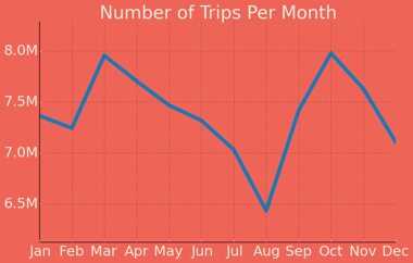
If we look at the number of cab rides month-over-month, we can see highs in March and October, and a minimum in August.
If we looked at weather data, we could probably find a relationship with some 'pleasantness' factor, and perhaps also some relationship
with seasonal business and event data.
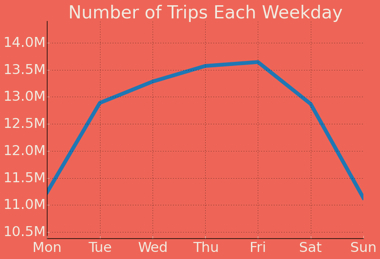
Hour of The Week
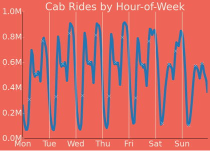
There's a corresponding trough that happens afterward - the lowest volume of rides for that 24 hour cycle. On most days it occurs at around 2am, but on Friday night and Saturday night, the lowest volume doesn't occur until about 6am.
The Drinking Hours
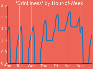
It's straightforward to map a taxi pickup time to this model, but we need to revisit our geographic data for the final part of our model: how we map our 'drinkiness' to actual stumbling distance.
Norms
The heatmap assumes that the influence of a drinking location spreads evenly in all directions. This means a person could walk through buildings or over geographic features. The function that translates a vector between two points into a distance is called a 'norm'. Instead of the more common L2 norm, it's tempting to use L1, which is also known (coincidentally) as the taxicab or Manhattan norm.
In fact a more realistic choice is to create our own norm: 'stumbling distance norm', defined as: "distance along streets, ignoring traffic restrictions like one-way streets". 2,500 directions requests per 24 hour period
The goal of this measurement is to determine the drinking locations within stumbling distance of each cab ride. Google Maps has a convenient API for routing requests: We can route from a taxi pickup to each of the bars around it.
11K bars X 88.6M rides = 974,600,000,000
Google Maps API allows 2,500 directions requests per 24 hour period
We can get this done in 1,068,054.79 years.
There are certainly great products out there for manipulating GIS data, but the whole point of this excursion is to use all free stuff and be able to run on a laptop.
With freely available shapefiles and mapping APIs, we can make a map in a few minutes.
Graph algorithms are broadly useful tools, if you can identify how to map your problem to a graph. In this case the mapping is straightforward and kind of common-knowledge: we can treat each intersection as a graph, and then use a shortest path algorithm.
The shapefile unfortunately doesn't have enough info: It defines streets as lines, it doesn't contain every intersection. We can solve this by finding the intersections ourselves geometrically - the green dots in this image.
By doing our own routing we no longer have to worry about a maximum number of requests per day, but it's still a huge number of calculations. A k-d tree (and a similar structure called a 'ball tree') are a way of pre-calculating where the bars occur, so that we can quickly look up which ones are closest using an arbitrary coordinate. These data structures are used 'under the hood' in many APIs for nearest neighbor searches, they're especially great when you have to find nearest neighbors over and over.
You can specify a point and a radius, the k-d tree will return all the points within that radius. This means we only have to do our routing between each cab ride and a small handful of points.
Note that we aren't using routing distance as a norm for the k-d tree. The maximum stumbling distance is in fact the euclidean norm, so we can use that as a simplification, then use our routing on the smaller number of points to leverage our stumbling distance norm.
To make this run even faster, we can round each cab ride pickup coordinate, and cache the results of the lookup. This simplification together with the k-d tree brings the run time down to a few minutes.
The End
At last! We now have a 'drinkiness' factor for both the time and location of relevant cab rides. To find if there's a relationship with drinkiness and tip percentage, we could simply use regression. In some cases linear regression is not enough to tell a full story.
If we look for a linear trend, the r-squared comes back as .02...no relationship. If we segment the population into the top and bottom quartiles, we can compare averages. Doing this, we find that the LEAST drunk people actually tip more, by about 0.06%. Only if we investigate the full distribution do we see some real differences.
3.10% of drunk people leave no tip at all, compared to 2.61% of sober people.
3.50% of drunk people leave an exorbitant tip (>30%), compared to 3.37% of sober people.
After all this, we are awarded with the insight that drunk people may have more extreme views than sober people.
I asked Steve if he would hail a cab over to have drinks with me, so we could discuss next steps, but he didn't believe that you can get a cab in Los Angeles.
Data Science.