88.6 Million Taxi Rides
We’ve mapped the bars. Now it’s time to look at the other side of the equation: the taxi rides.
The dataset contains 174 million trip records. Let’s see how many of them we can actually use.
The Breakdown
Here’s how those 174 million records roughly shake out:
| Category | Records |
|---|---|
| Bad data (missing fields, impossible coordinates, etc.) | 4.0M |
| Airport rides (JFK, LaGuardia, harbors, train stations) | 6.2M |
| Everything else | 163.6M |
We already know why we’re excluding airport rides — the liquor license data there is misleading, thanks to that one administrative building at JFK holding 47 licenses. The bad data rows have issues like pickup coordinates in the middle of the Atlantic Ocean, dropoffs on the moon, or fare amounts of negative six thousand dollars. Data science is glamorous.
The Cash Problem
Excluding the problematic records, let’s look at who actually leaves tips:
| Payment Type | Rides | Non-tippers |
|---|---|---|
| Cash | 75.0M | 99.99% |
| Non-cash (credit/debit) | 88.6M | 3.48% |
Read that again: 99.99% of cash-paying riders report zero tip.
We won’t speculate on the reasons. Perhaps cash tips are simply not recorded in the system. Perhaps the taxi meter’s “cash” setting doesn’t have a tip field. Perhaps there is something about cash transactions that discourages tip reporting. We said we wouldn’t speculate, and yet.
What we will do is acknowledge that the cash tip data is essentially useless for our purposes. If virtually no cash rides report tips, we can’t use them to study tipping behavior. We’ll focus entirely on non-cash transactions, where the credit card system captures tip amounts reliably.
This cuts our dataset down to a mere 88.6 million records. Still far more than any spreadsheet or desktop tool can handle, but manageable for a single machine with some patience and a decent data pipeline.
Patterns in Time
With our working dataset defined, let’s see how taxi rides relate to time. We need this for the temporal component of our drinkiness model — the idea being that rides at certain times of the week are more likely to involve drinking.
Monthly Trends
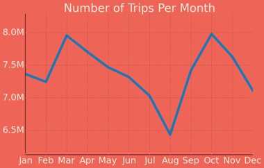
Month-over-month, we see highs in March and October and a minimum in August. If we cross-referenced weather data, we’d probably find a “pleasantness factor” — New Yorkers take more cabs when the weather is nice but not too nice, and fewer when it’s unbearably hot or they’ve fled the city for summer.
But before drawing dramatic conclusions, note the Y-axis:
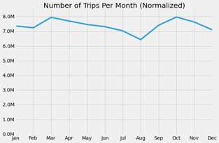
When we normalize to start at zero, the monthly variation mostly disappears. These aren’t dramatic swings — they’re gentle waves. The difference between the busiest and quietest month is modest.
Daily Patterns
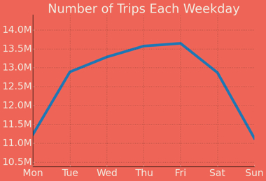
Rides peak on Fridays and bottom out on Sundays, which should surprise approximately nobody. But again, check the normalized view:
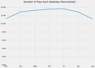
Not as dramatic as you might think. The daily variation is real but not extreme.
Hour of the Week — Where It Gets Interesting
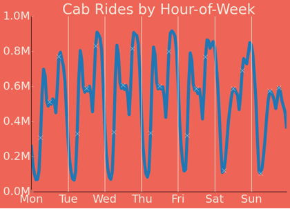
This is the chart that gets us somewhere.
The red vertical lines separate the days, and the small dots mark each 6-hour period. Here’s what the data reveals:
- Morning peak: Rides hit a consistent peak around 10am each weekday — the morning commute, errands, the general bustle of a workday city.
- Weekend noon peak: On Saturdays and Sundays, there’s a smaller midday peak — brunch runs, tourist activity, the Saturday errand circuit.
- The evening peak migration: There’s an evening peak every day, but it shifts later through the week. Monday’s peak is around 6pm (leaving work). By Friday, it’s pushing toward midnight.
- The trough: After each evening peak, ride volume drops to its daily minimum. On weekdays, that minimum is around 2am. But on Friday and Saturday nights, the minimum doesn’t hit until about 6am.
That Friday-to-Saturday pattern — the evening peak sliding toward midnight, with the dead zone not arriving until dawn — is the temporal signature of a city going out drinking. The rides don’t stop because people aren’t going home; they stop because even New Yorkers eventually run out of steam.
This is exactly the kind of signal we can use in our drinkiness model.
We now have both ingredients: geographic drinkiness (proximity to bars) and temporal drinkiness (time-of-week patterns). But combining them requires solving a spatial problem that’s harder than it first appears. In the next post, we’ll build a custom “stumbling distance” metric and discover that the naive approach would take approximately one million years.