Mapping Every Bar in New York City
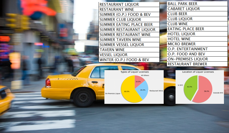
To figure out whether taxi passengers were drinking, we first need to know where the drinking is. New York State publishes a quarterly list of all active liquor licenses, and it turns out there are roughly 11,000 of them in New York City alone.
Not all liquor licenses are created equal, though. A full on-premises liquor license — your neighborhood dive bar, the kind of place with a neon “OPEN” sign and a bartender named Sal — is substantially more “drinky” than a hotel wine license or a catering permit.
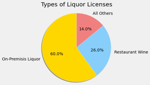
And it turns out the state data has a lot of variety. On-premises liquor licenses make up 60% of the total, restaurant wine accounts for 26%, and the remaining 14% is a grab bag of everything from hotel wine to ball park beer to “summer vessel liquor” (which is apparently a thing).
To account for the differences, we assigned each license type a weight reflecting its contribution to street-level drinkiness.
The weighting is subjective — there’s no peer-reviewed journal of drinkiness — but the logic is straightforward: places where people go specifically to drink get a higher weight than places where alcohol is a side feature. A full bar gets maximum weight. A grocery store that sells wine gets almost none.
Three Maps, Three Perspectives
With 11,000 points of data, a spreadsheet isn’t going to cut it. We need to see this geographically. I built three different interactive maps using Leaflet.js, each designed to reveal something different about the data.
The Coverage Map
The coverage map plots each liquor license location as a circle, color-coded by license type. The radius represents a reasonable “stumbling distance” — how far someone might walk from a bar to hail a cab. You can adjust this radius to explore different assumptions about stumbling range.
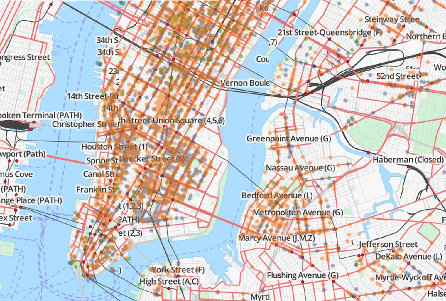
This map is great for seeing the raw distribution: where are the bars, and what kinds are they? Manhattan is, unsurprisingly, a solid wall of overlapping circles. The outer boroughs are spottier, with clusters around commercial strips and transit hubs.
The main limitation is exactly that overlap. In dense areas, everything bleeds together and you lose the sense of how much drinkier one block is than another. For that, we need a heatmap.
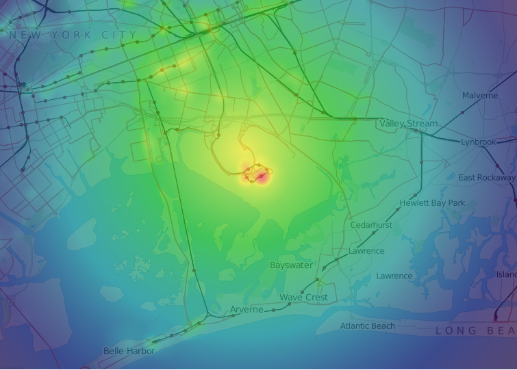
The Heatmap
The heatmap aggregates the weighted liquor licenses into a smooth gradient. Hotter colors mean more drinking establishments (weighted by type) per unit area.
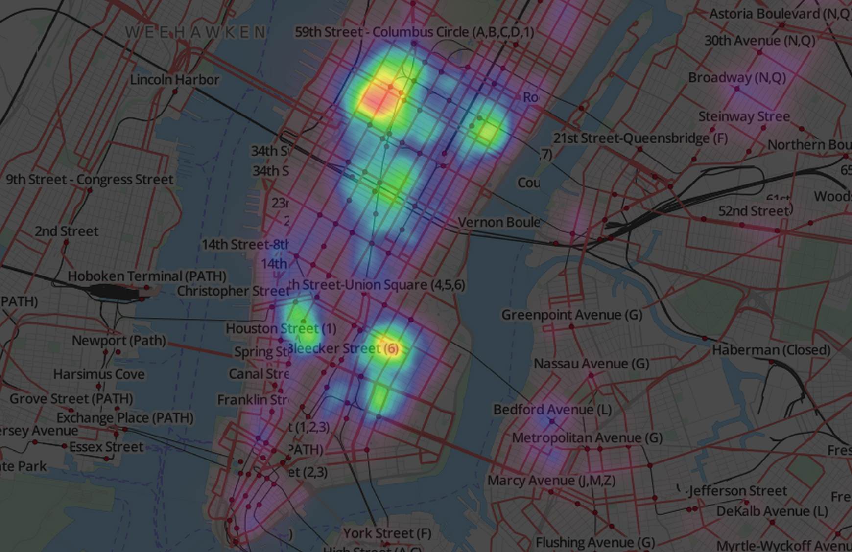
This is where things get interesting. The heatmap reveals relative drinkiness — you can immediately see the hot zones in the East Village, the Lower East Side, Hell’s Kitchen, and Williamsburg. Zoom in and you’ll find that many areas that appear empty at full zoom actually have some heat — they’re just overwhelmed by the stronger areas when you’re zoomed out. The color is relative to everything visible on the map, so the hottest spot on screen always dominates.
This relativity is a feature, not a bug. It makes anomalies jump right out, because an unusually hot spot stands out like a bonfire in a field of candles.
Speaking of anomalies…
The JFK Problem
If you look at the heatmap zoomed out to include all five boroughs, something strange jumps out near JFK airport. It glows like a white-hot sun. This is not a neighborhood known for its nightlife.
What’s going on? We need a map that lets us drill into the details.
The Cluster Map
The cluster map uses marker clustering — zoom out and you see numbered circles showing how many licenses are in an area. Zoom in and you can click on individual establishments to see their names and license types.
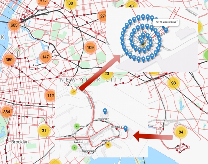
Zooming into the JFK anomaly reveals the answer: a single small administrative building holds 47 liquor licenses. Click on them and you’ll see the names — Delta Sky Club, American Airlines Admirals Club, JetBlue terminal bars, and various airport restaurants. The airlines register all their licenses at a single administrative address, which makes it look like the hottest drinking spot in the city.
This is exactly the kind of insight that geographic visualization reveals and a spreadsheet hides. JFK isn’t really a drinking hotspot — it’s an administrative artifact. And if we left it in our model, every taxi ride from JFK would get a sky-high drinkiness score, which would poison our analysis.
Cleaning the Map
Armed with this discovery, we filtered out rides originating from airports, harbors, and major train stations. These locations have inflated drinkiness scores for administrative or transportation-related reasons that have nothing to do with nightlife.
The cleaned heatmap now reflects actual street-level drinking geography. Manhattan still dominates, but the real hot zones — the Village, LES, Williamsburg, Hell’s Kitchen — now stand out without the airport distortion.
With our geographic drinkiness data cleaned and mapped, we need the other half of the equation: the taxi rides themselves. In the next post, we’ll dig into 174 million taxi records and discover some surprising things about who tips, when, and how much.