First Contact — Statistics and Distributions in High Dimensions
In the last post, we embedded 50,000 IMDB movie reviews into 768-dimensional vectors. Each review is now a point in a space we can’t see or visualize directly. The natural impulse is to immediately run UMAP, get a pretty 2D scatter plot, and call it a day.
Resist that impulse.
Why Look Before You Leap
Projection algorithms like UMAP and t-SNE will always produce a picture. They’ll always show you clusters, gradients, and structure — even if the underlying data is random noise. If you don’t know what your data looks like before projection, you can’t tell whether the patterns you see are real or artifacts.
Embedding models can produce degenerate outputs. All vectors might land in a tiny region of the space (no structure to find). Norms might vary wildly (a few documents dominate distance calculations). Some dimensions might carry all the information while hundreds of others are noise. You need to detect these problems before they contaminate downstream analysis.
This is the same philosophy as the neural nets series: don’t just look at the final output. Look at what’s happening inside. The “boring” diagnostic step is what separates analysis from hallucination.
So let’s look at our data.
Norms: Are All Vectors Created Equal?
The first thing to check: vector magnitude. The L2 norm of each embedding tells you how “far from the origin” each review sits in the 768-dimensional space. If norms vary wildly, some reviews will dominate distance-based calculations simply because their vectors are longer.
import numpy as np

data = np.load("data/imdb_embeddings.npz", allow_pickle=True)
embeddings = data["embeddings"]  # shape: (50000, 768)

norms = np.linalg.norm(embeddings, axis=1)
print(f"Mean:  {norms.mean():.6f}")
print(f"Std:   {norms.std():.6f}")
print(f"Range: [{norms.min():.6f}, {norms.max():.6f}]")
Mean:  1.000000
Std:   0.000000
Range: [1.000000, 1.000000]
Every vector has norm exactly 1.0 — because we normalized during embedding. This is worth checking even when you think you’ve normalized; data pipelines have a way of introducing surprises. In this case, we’re clean: every review sits on the surface of the unit hypersphere in 768 dimensions.
If you inherit someone else’s embeddings and the norms aren’t uniform, that’s your first red flag. Normalize them (divide each vector by its norm) before doing anything else, or use cosine similarity (which implicitly normalizes) instead of Euclidean distance.
The Sniff Test: Is There Structure?
The single most important diagnostic for embedding data: the distribution of pairwise cosine similarities.
If all pairs have similarity ~0.95, your embeddings are nearly identical — the model couldn’t distinguish the texts, or the encoding collapsed. Projection won’t help because there’s nothing to separate. If there’s a wide spread with interesting shape, there’s structure to find.
We can’t compute all 1.25 billion pairs (50,000 × 50,000), but sampling 100,000 random pairs gives us a reliable picture:
rng = np.random.default_rng(42)
n_samples = 100_000

idx_i = rng.integers(0, len(embeddings), size=n_samples)
idx_j = rng.integers(0, len(embeddings), size=n_samples)
mask = idx_i != idx_j  # exclude self-pairs
idx_i, idx_j = idx_i[mask], idx_j[mask]

# For unit vectors, cosine similarity = dot product
pair_sims = np.sum(embeddings[idx_i] * embeddings[idx_j], axis=1)

print(f"Mean:   {pair_sims.mean():.4f}")
print(f"Std:    {pair_sims.std():.4f}")
print(f"Range:  [{pair_sims.min():.4f}, {pair_sims.max():.4f}]")
print(f"5th %:  {np.percentile(pair_sims, 5):.4f}")
print(f"95th %: {np.percentile(pair_sims, 95):.4f}")
Mean:   0.3259
Std:    0.1272
Range:  [-0.1164, 0.8858]
5th %:  0.1168
95th %: 0.5376
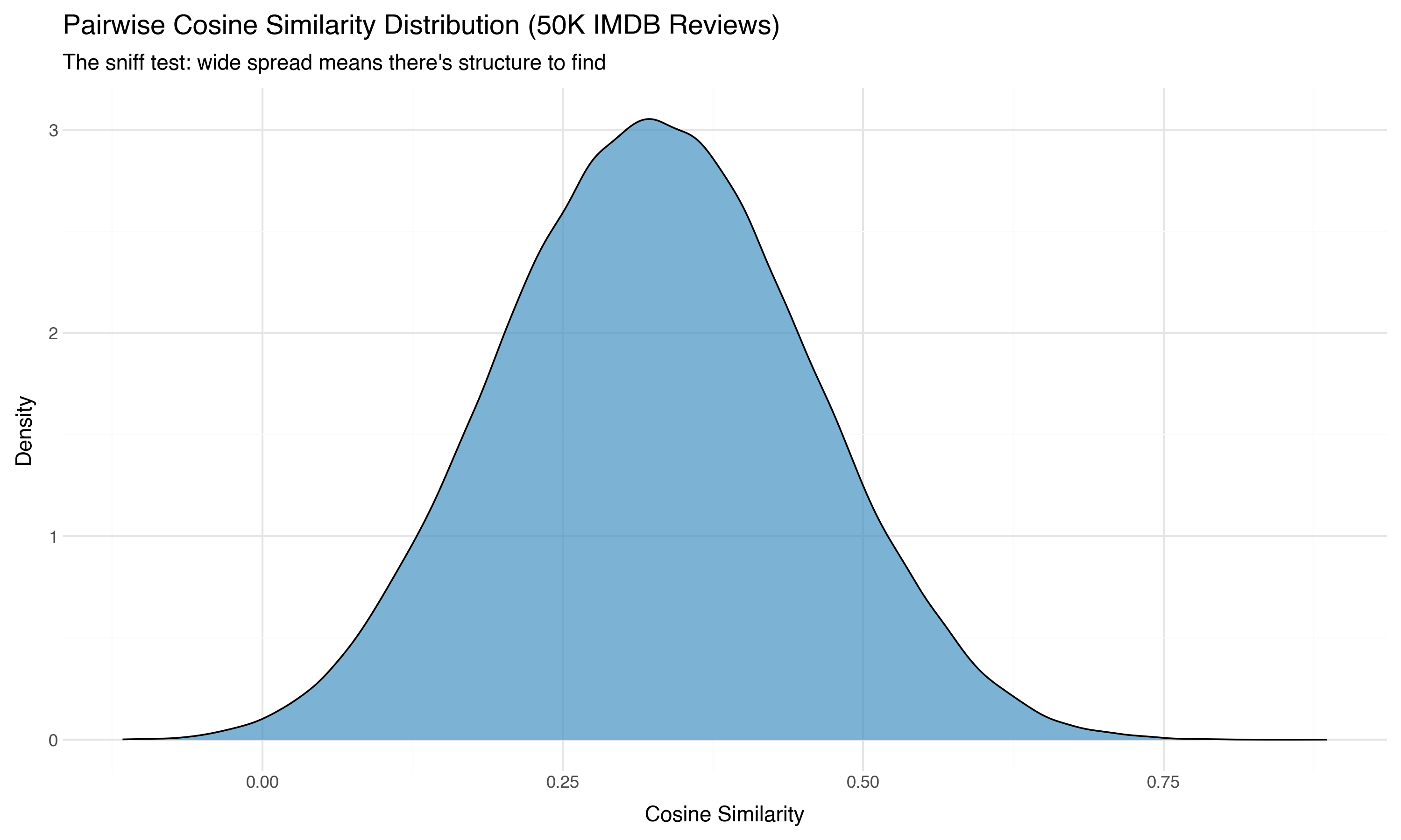
This is a healthy distribution. The mean is 0.33 (most pairs are somewhat similar — they’re all movie reviews, after all), but the spread is wide. Some pairs are nearly orthogonal (similarity ~0), others are highly similar (0.89). That range tells us there’s genuine structure in this space — different reviews live in meaningfully different regions.
Now here’s where it gets interesting. We know whether each review is positive or negative. If we color the pairs by whether they share the same sentiment:
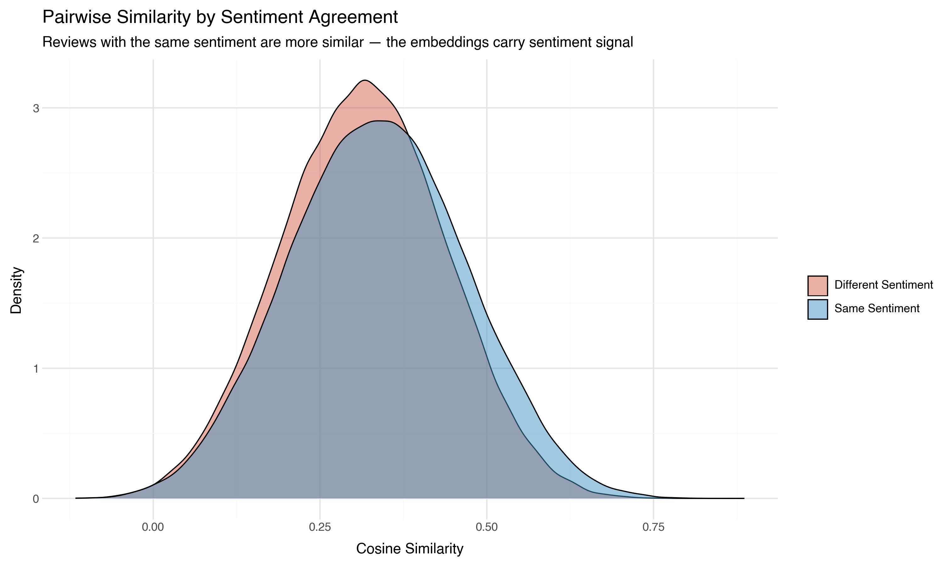
Same-sentiment pairs are shifted rightward — more similar on average than cross-sentiment pairs. The embeddings carry sentiment signal, even though the model was never trained on sentiment labels. It learned from general language patterns that positive reviews use language more like other positive reviews than like negative ones.
This is the first real finding from our data, and we haven’t projected or clustered anything yet. We’ve just counted.
The Curse of Dimensionality
Here’s a fact that breaks intuition from 2D and 3D experience: in high dimensions, distances converge. The farthest point and the nearest point become relatively similar in distance. The “contrast” between near and far fades.
This isn’t abstract. We can measure it directly in our embeddings by looking at the coefficient of variation (standard deviation divided by mean) of pairwise distances at different dimensionalities:
sample = embeddings[rng.choice(len(embeddings), 1000, replace=False)]

for d in [2, 5, 10, 25, 50, 100, 200, 400, 768]:
    sub = sample[:, :d]  # First d dimensions
    # Sample pairwise distances (excluding self-pairs)
    idx_a = rng.integers(0, len(sub), size=6000)
    idx_b = rng.integers(0, len(sub), size=6000)
    keep = idx_a != idx_b
    dists = np.linalg.norm(sub[idx_a[keep][:5000]] - sub[idx_b[keep][:5000]], axis=1)
    cv = dists.std() / dists.mean()
    print(f"  {d:4d} dimensions → CV = {cv:.3f}")
     2 dimensions → CV = 0.548
     5 dimensions → CV = 0.354
    10 dimensions → CV = 0.256
    25 dimensions → CV = 0.181
    50 dimensions → CV = 0.142
   100 dimensions → CV = 0.122
   200 dimensions → CV = 0.107
   400 dimensions → CV = 0.100
   768 dimensions → CV = 0.098
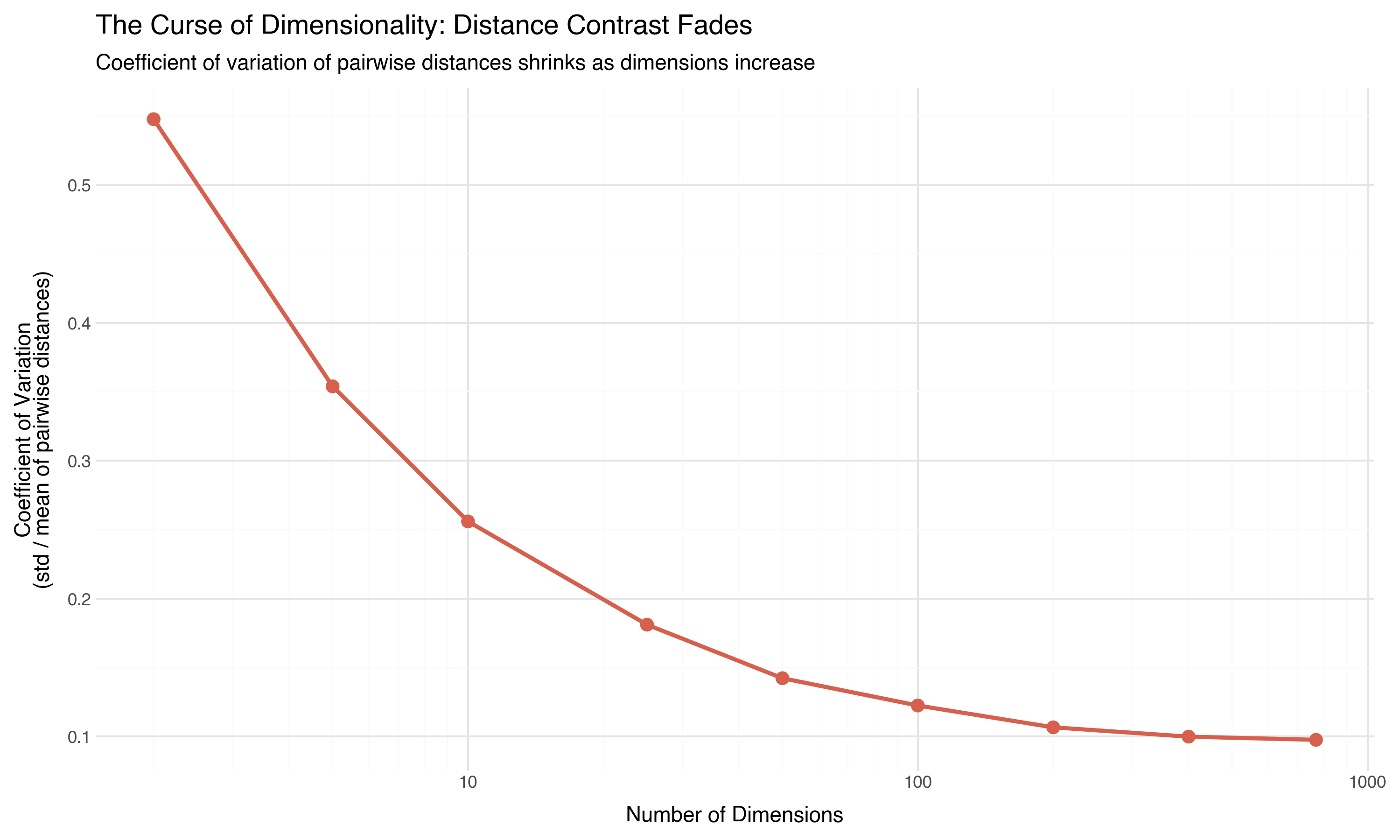
In 2 dimensions, distances vary by a coefficient of 0.55 — there’s lots of contrast between near and far. By 768 dimensions, it’s 0.10. Distances have converged to a narrow band around the mean. The “nearest neighbor” and the “20th nearest neighbor” are almost the same distance away.
This has real consequences:
- k-nearest neighbors becomes unreliable because “nearest” barely means anything
- k-means struggles because cluster assignments depend on small distance differences
- Any algorithm that uses a distance threshold (DBSCAN’s
eps, for instance) becomes fragile — small changes in the threshold dramatically change the results
This is why we can’t just work in 768 dimensions directly. We need to project down to a space where distance contrast is meaningful again. But the curse also tells us something hopeful: if there’s any detectable structure at 768 dimensions, it must be strong, because the curse is working against us.
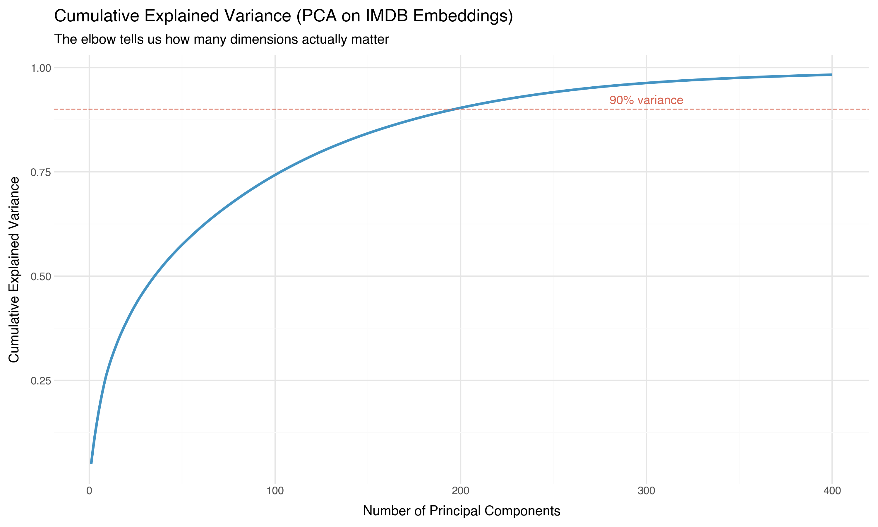
Effective Dimensionality: How Many Dimensions Actually Matter?
Our vectors have 768 components, but that doesn’t mean there are 768 independent axes of variation. If the data lies on a lower-dimensional surface within the 768-dimensional space — a “manifold” — then most of those dimensions are redundant.
PCA (principal component analysis) gives us a direct answer. It finds the directions of maximum variance in the data and tells us how much each direction contributes:
from sklearn.decomposition import PCA

# Fit PCA on a 10K subsample (more than enough)
pca = PCA(n_components=400)
pca.fit(embeddings[rng.choice(len(embeddings), 10_000, replace=False)])

cumvar = np.cumsum(pca.explained_variance_ratio_)

for threshold in [0.5, 0.8, 0.9, 0.95, 0.99]:
    n_comp = np.searchsorted(cumvar, threshold) + 1
    print(f"  {threshold*100:.0f}% variance → {n_comp} components (of 768)")
  50% variance → 36 components (of 768)
  80% variance → 126 components (of 768)
  90% variance → 197 components (of 768)
  95% variance → 267 components (of 768)
  99% variance → 401 components (of 768)
Thirty-six components capture half the information. About 200 capture 90%. The effective dimensionality of our 768-dimensional embeddings is somewhere around 200 — high, but dramatically lower than 768.
The scree plot — variance per component — makes the concentration even more vivid:
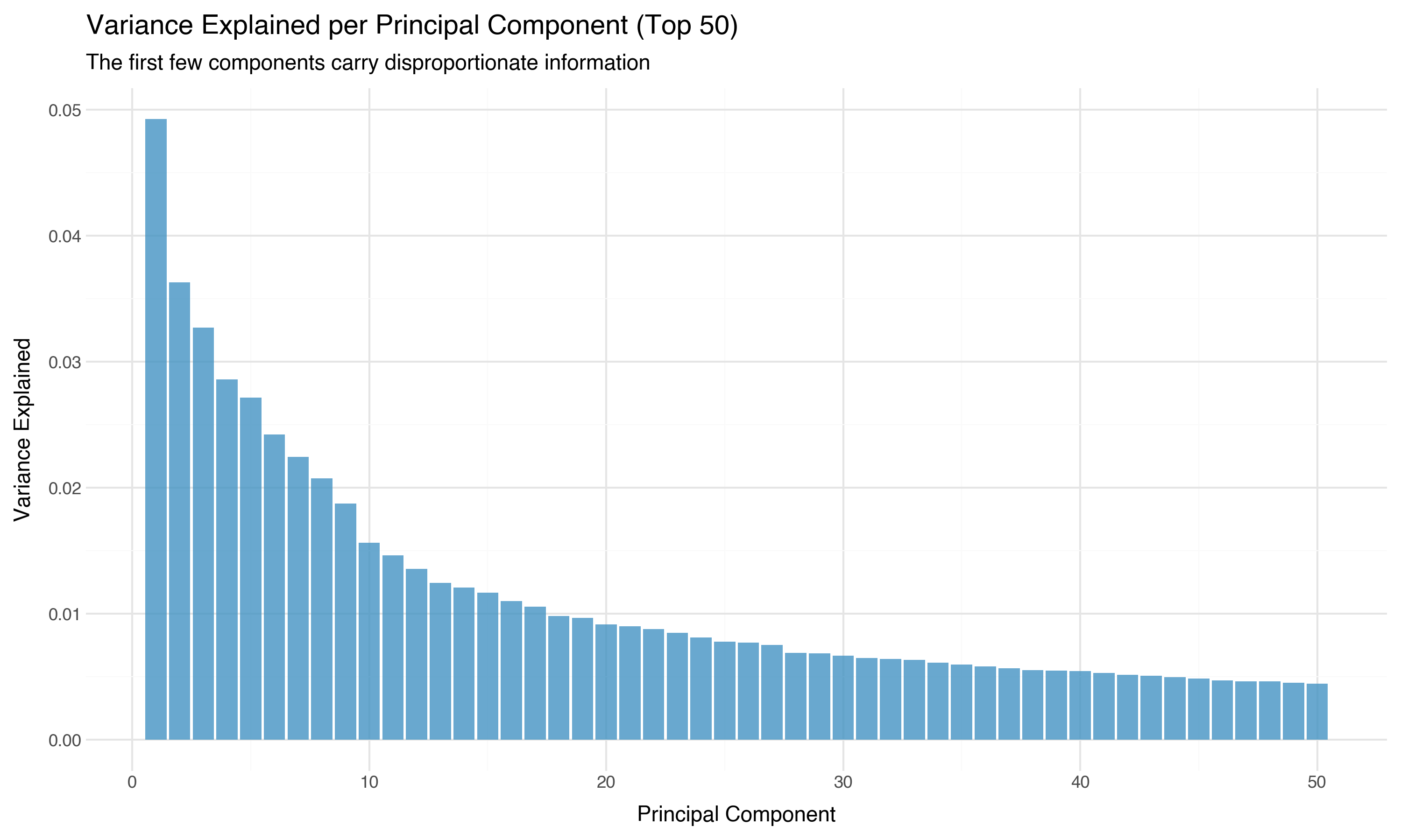
The first principal component alone captures more variance than the bottom 400 combined. The information is concentrated in a relatively low-dimensional subspace. This is why projection methods like UMAP can work: there’s a lower-dimensional structure hiding inside the 768 dimensions, and projection algorithms are designed to find it.
A Preview: Can We See Anything with Just Two Dimensions?
We’ll give PCA, t-SNE, and UMAP a full treatment in the next post. But while we have PCA running, let’s take a quick look. Two principal components capture only a small fraction of the total variance — what can they possibly show?
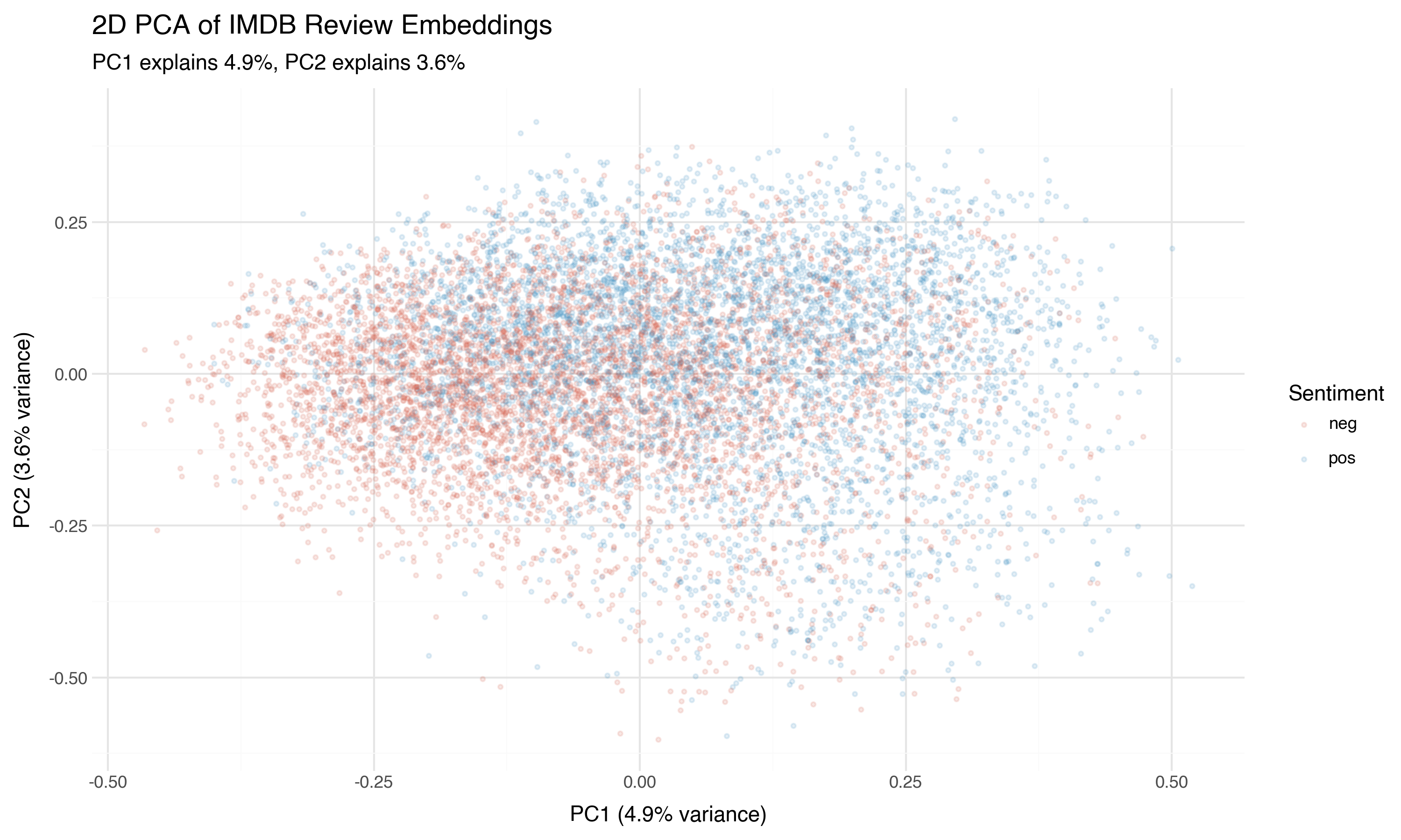
Something. Not much, but something. There’s a tendency for positive reviews (blue) to concentrate in one region and negative reviews (red) in another, but the overlap is massive. PCA is a linear projection — it finds the single best flat plane through the data. If the sentiment boundary is curved (and it almost certainly is), PCA will blur it.
Now the same projection, but colored by the actual star rating (1–10) instead of the binary sentiment label:
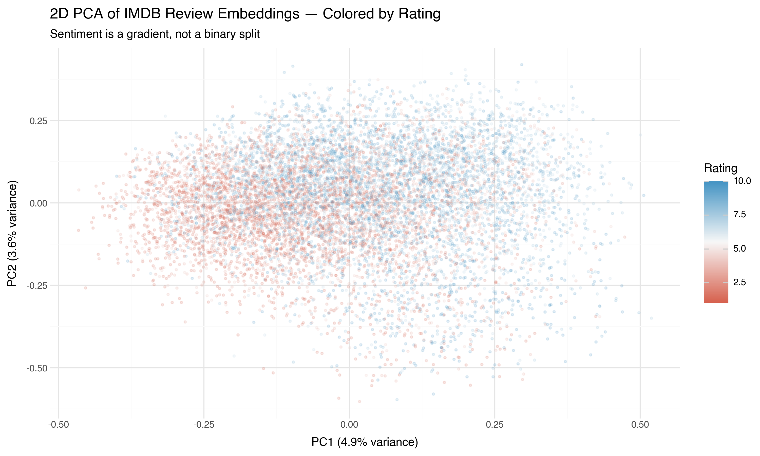
This is more revealing. Sentiment isn’t a binary switch — it’s a gradient. The 1-star reviews (deep red) are in a different region than the 10-star reviews (deep blue), with the middle ratings genuinely in the middle. The embedding space has captured not just “positive vs. negative” but the degree of sentiment.
Two dimensions can’t do this justice. But the signal is there. In the next post, we’ll use nonlinear projection methods that can trace the curved structure PCA misses.
Practical Takeaways
If you’ve just embedded a large corpus and want to understand what you’re working with, here’s the diagnostic checklist:
Check norms. If they’re not uniform, normalize (or figure out why they vary). Wildly different norms distort distance-based analyses.
Plot pairwise cosine similarities. If the distribution is narrow and peaked near 1.0, your embeddings may have collapsed — projection won’t help. A wide spread (like our 0.12 to 0.89) means there’s structure to find.
Look for known signal. If you have labels (like our sentiment), check whether same-label pairs are more similar than cross-label pairs. If they’re not, the embeddings may not carry the signal you need.
Estimate effective dimensionality. Run PCA and look at the cumulative variance curve. If 90% of variance is in the first 50 components, your data lives in a low-dimensional subspace — good news for projection. If variance is spread evenly across hundreds of components, projection will lose a lot of information.
Respect the curse. Distance contrast fades in high dimensions. Don’t trust distance-based analyses in the raw 768-dimensional space. Project first, then cluster.
None of this is glamorous. No one shares a histogram of pairwise cosine similarities on social media. But these diagnostics are the difference between analysis and superstition. When you find clusters in a UMAP plot, you want to know whether the structure was there all along — or whether the algorithm invented it.
Our data passed the sniff test. The structure is real: there’s a wide spread in pairwise similarities, sentiment signal is detectable, and the effective dimensionality (~200) is low enough that projection should preserve most of the meaningful structure.
Now let’s learn to see it.
Previous: What Embeddings Actually Are