Graph Analysis — When Connections Tell the Story
So far in this series, every analysis has treated each review as an independent point — a vector in embedding space, a row in a feature matrix. We’ve projected, clustered, and colored these points, but we’ve never asked the obvious question: how do they connect?
This post adds a new perspective: the graph. Instead of treating reviews as isolated points in space, we build a network where similar reviews are linked, then use the structure of that network to discover patterns that spatial clustering misses.
From Points to Edges
The embedding space already contains the raw material for a graph. Two reviews are “related” if their embeddings are close — and we’ve been computing those distances all series. The question is how to formalize “close” into an explicit network.
We build a k-nearest-neighbor (k-NN) graph: each review is a node, connected to its 15 most similar reviews by cosine similarity, with a minimum similarity threshold of 0.3 to avoid spurious edges.
from sklearn.neighbors import NearestNeighbors
import networkx as nx

nn = NearestNeighbors(n_neighbors=16, metric="cosine")
nn.fit(embeddings)
distances, indices = nn.kneighbors(embeddings)

G = nx.Graph()
for i in range(len(embeddings)):
    for j_idx in range(1, 16):  # skip self
        j = indices[i, j_idx]
        similarity = 1 - distances[i, j_idx]
        if similarity > 0.3:
            G.add_edge(i, j, weight=similarity)
The result: a graph with 10,000 nodes and 129,001 edges. The average node has about 26 connections (some edges are mutual — if A is in B’s k-NN and B is in A’s k-NN, that’s one undirected edge).
What the Graph Looks Like
Before running any algorithms, the graph structure itself tells a story:
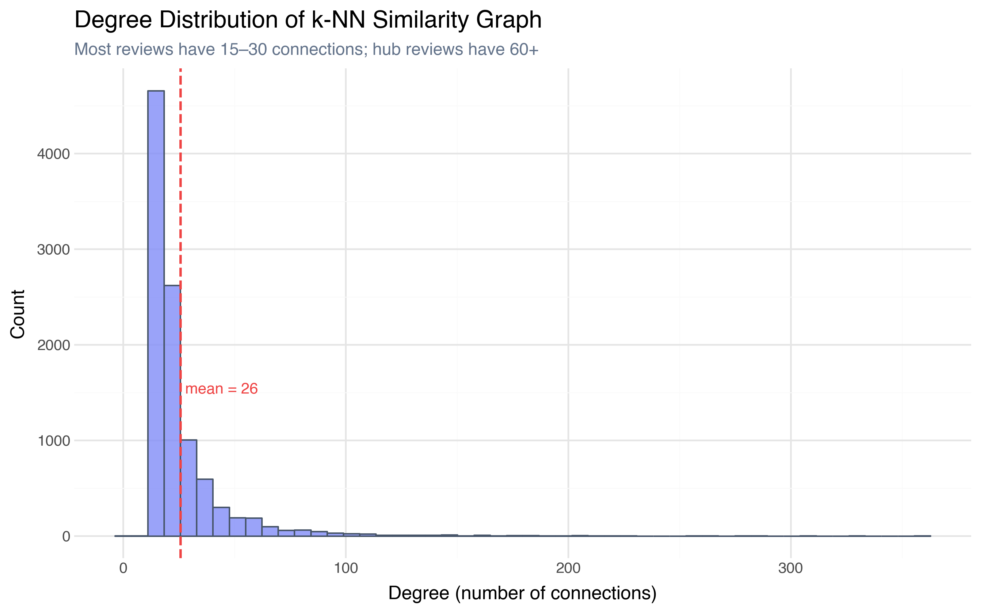
The degree distribution is heavily skewed right — the median review has 19 connections, but some “hub” reviews have over 300. These hubs are typically generic reviews that are moderately similar to many others — the “this movie was okay” type that sits in the center of embedding space. The reviews with the fewest connections (some have only 2) are the niche outliers — highly specific reviews that have few close neighbors above the 0.3 similarity threshold.
This already tells us something HDBSCAN couldn’t: which reviews are “typical” (high degree, many connections) and which are “distinctive” (low degree, few close neighbors), regardless of whether they fall inside a density cluster.
Community Detection: Louvain
A graph has its own notion of “clusters” — communities: groups of nodes that are more densely connected to each other than to the rest of the graph. The Louvain algorithm finds communities by optimizing modularity — a measure of how much the internal connection density of each group exceeds what you’d expect by random chance.
communities = nx.community.louvain_communities(G, resolution=1.0, seed=42)
Louvain found 18 communities — substantially more than HDBSCAN’s 7 clusters:
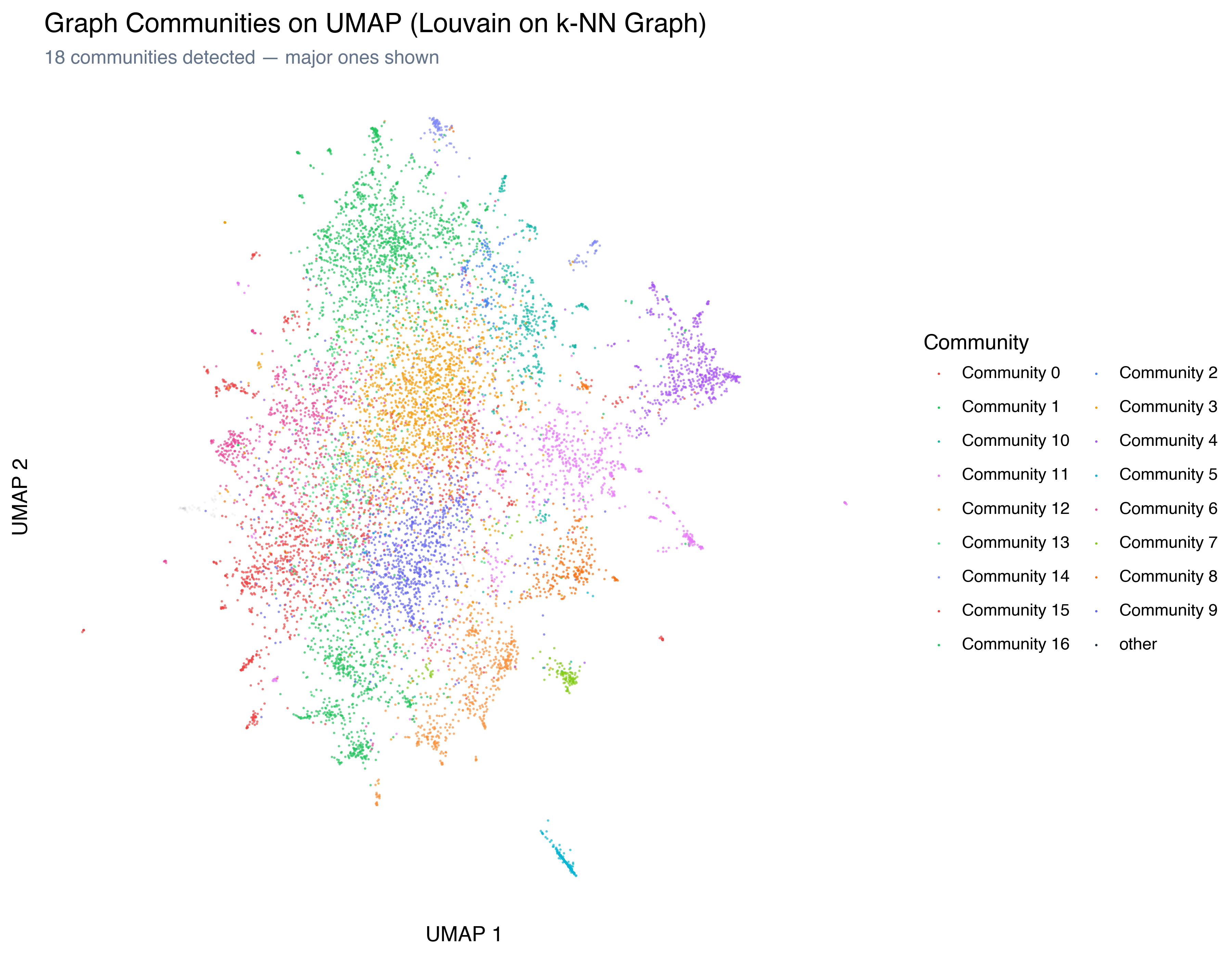
The graph sees finer-grained structure. Where HDBSCAN found one massive “everything else” cluster (80% of the data), Louvain split it into multiple meaningful communities. This makes sense: HDBSCAN looks for density gaps, and the main mass of reviews has no density gaps. But graph communities look at connection patterns, and reviews in different parts of that mass connect to different neighborhoods.
What’s in the Communities?
We can apply the same TF-IDF keyword extraction from Post 5 to the Louvain communities:
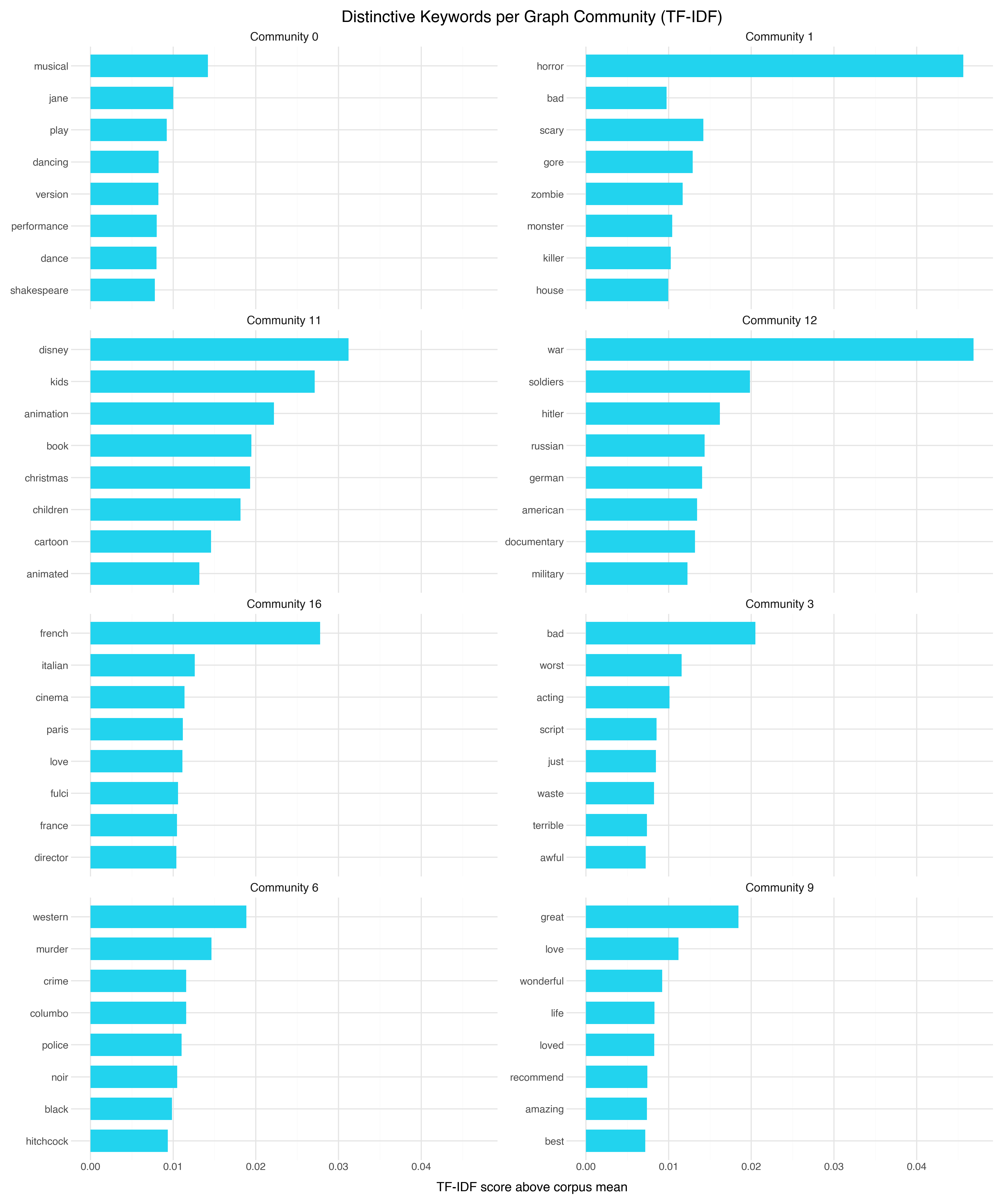
Some communities align with HDBSCAN’s clusters — TV series, animation, horror all appear. But the graph found rich structure that HDBSCAN merged into the “everything else” bucket:
| Community | Size | Keywords | What HDBSCAN saw |
|---|---|---|---|
| 3 | 1,476 | bad, worst, acting, script | Part of “General” cluster |
| 1 | 1,423 | horror, scary, gore, zombie | Matched horror cluster |
| 9 | 999 | great, love, wonderful, life | Part of “General” cluster |
| 0 | 910 | musical, jane, play, dancing | Part of “General” cluster |
| 6 | 698 | western, murder, crime, columbo | Part of “General” cluster |
| 11 | 695 | disney, kids, animation, christmas | Matched animation cluster |
| 16 | 674 | french, italian, cinema, paris | Part of “General” cluster |
| 12 | 546 | war, soldiers, hitler, russian | Part of “General” cluster |
| 4 | 540 | episode, series, episodes, season | Matched TV series cluster |
| 10 | 406 | space, fi, sci, alien | Part of “General” cluster |
| 15 | 364 | funny, comedy, jokes, laugh | Part of “General” cluster |
Community 3 (negative rants) and Community 9 (enthusiastic praise) are sentiment communities — the graph found that angry reviewers and ecstatic reviewers each form tight internal networks, regardless of genre. Communities 0 (musicals/period drama), 6 (crime/westerns), 16 (European cinema), 12 (war films), 10 (sci-fi), and 15 (comedy) are all genre communities that HDBSCAN couldn’t see because they’re interspersed in the main density mass.
These communities aren’t density-separated in UMAP space — they’re interspersed throughout the main cloud. But they form connection clusters because reviewers who write about war films use a shared vocabulary and reference the same movies, creating tighter internal edges than the surrounding reviews.
How Do Graph Communities Compare to HDBSCAN Clusters?
The Adjusted Rand Index between HDBSCAN clusters and Louvain communities is 0.06 — essentially no agreement beyond chance. But that doesn’t mean one is right and the other wrong. They’re answering different questions.
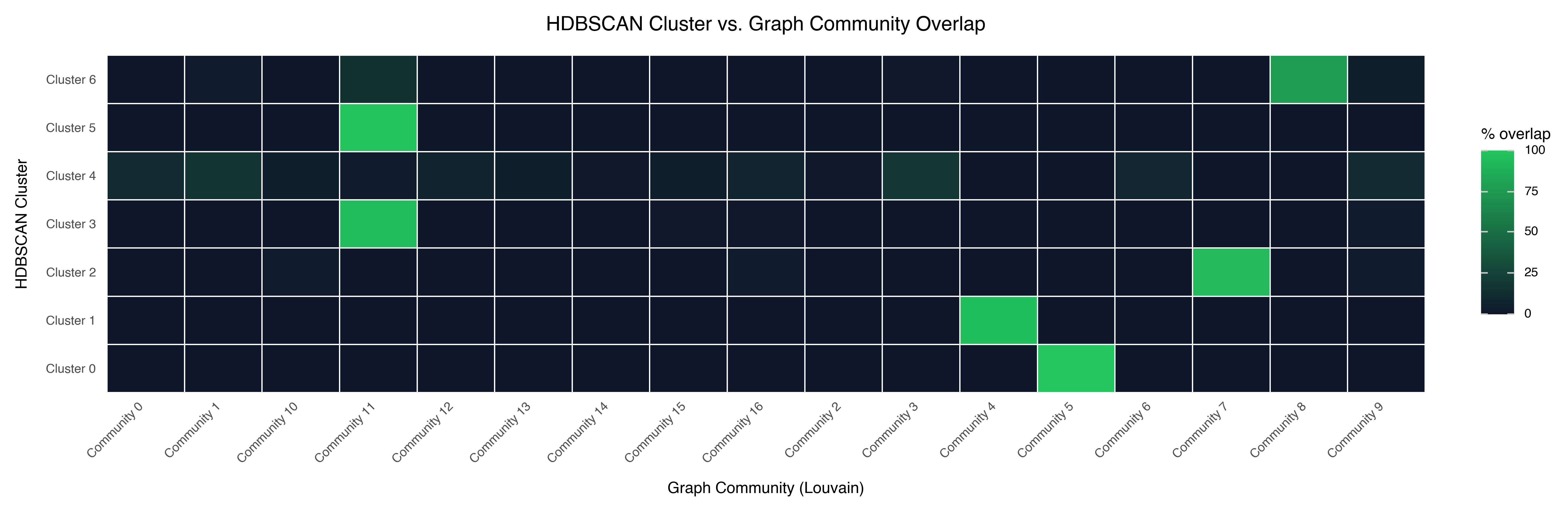
A few patterns in the alignment:
The niche HDBSCAN clusters map cleanly to single communities. Cluster 0 (Bollywood) maps perfectly to Community 5. Cluster 1 (TV series) maps to Community 4. These are genuinely distinct groups that both methods independently identify.
The large HDBSCAN Cluster 4 spans many communities. Louvain found meaningful sub-structure — different genres, different writing styles, different eras — within the region that HDBSCAN treats as undifferentiated.
Some communities span multiple HDBSCAN clusters. These are reviews that are similar in network position (they connect to similar neighborhoods) but differ in density structure.
node2vec: Learning Graph Embeddings
Community detection tells you which groups exist in the network. But what if you want a continuous representation — a way to measure how “graphically similar” two reviews are, the way cosine similarity measures how semantically similar they are?
node2vec learns a vector representation for each node in the graph by running biased random walks from every node and treating the walk sequences like “sentences” — the same trick that word2vec uses to learn word vectors from text. Nodes that appear in similar walk contexts get similar vectors.
from node2vec import Node2Vec

# Configure random walks
n2v = Node2Vec(
    G, dimensions=64, walk_length=30, num_walks=200,
    p=1.0, q=1.0,  # unbiased walks
    workers=1, seed=42,
)

# Learn embeddings (same algorithm as word2vec)
model = n2v.fit(window=10, min_count=1, batch_words=4)

# Extract the node vectors
graph_embeddings = np.array([model.wv[str(i)] for i in range(len(embeddings))])
The p and q parameters control the walk behavior:
- p controls the likelihood of immediately revisiting a node (higher p → less backtracking)
- q controls whether walks prefer to explore outward or stay close (higher q → more local, lower q → more exploratory)
With p=1, q=1 (unbiased), the walks balance between local and global structure. This is a reasonable default — we can tune later if we want to emphasize one over the other.
What Do Graph Embeddings Capture?
To see what node2vec learned, project the 64-dimensional graph embeddings to 2D with UMAP — the same approach we used for the text embeddings:
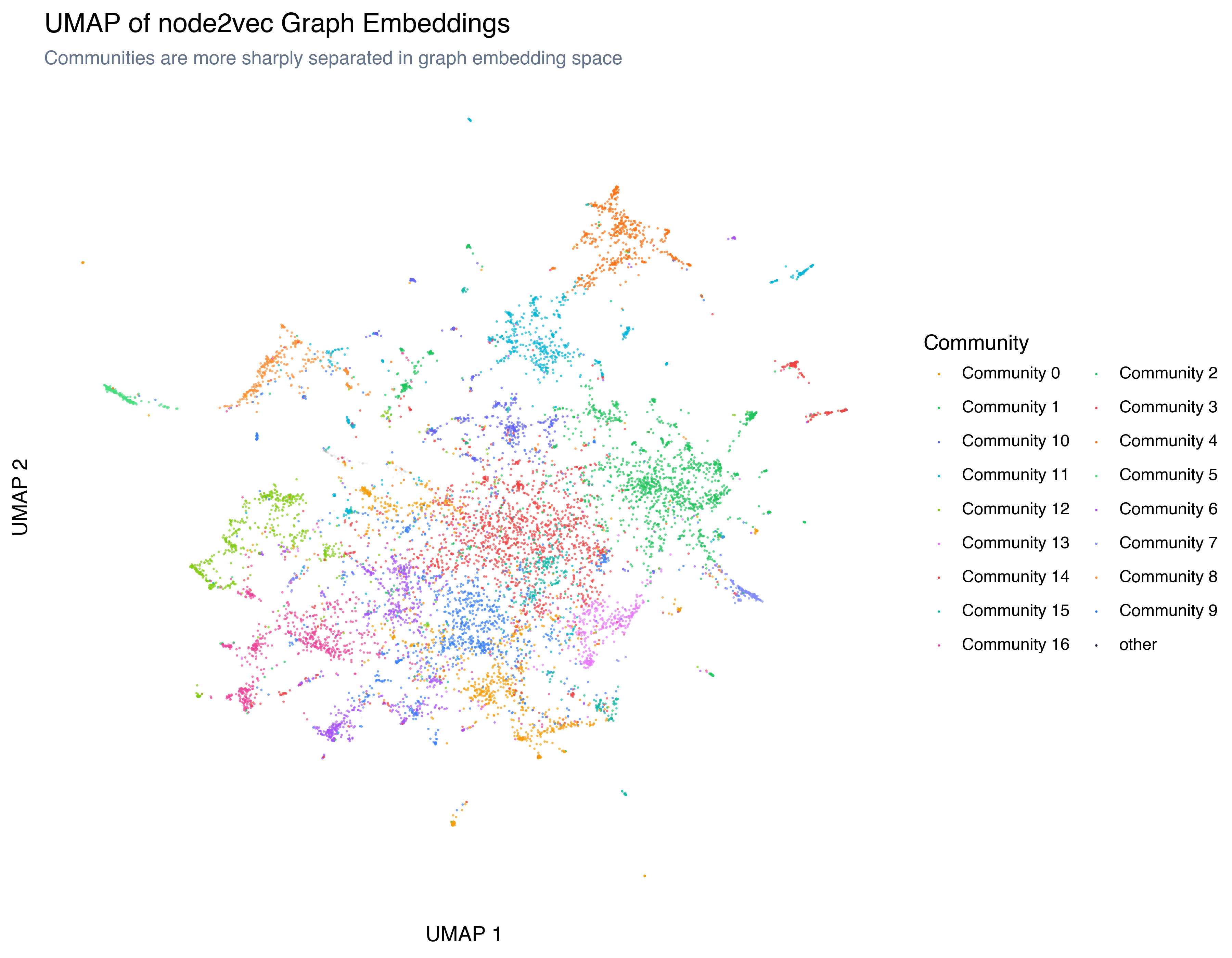
The structure is different from the text embedding UMAP. Communities are more sharply separated (the graph embedding encodes community membership more directly), and the overall topology reflects connection patterns rather than semantic content.
Text Embeddings vs. Graph Embeddings
The real insight comes from comparing the two embedding spaces. When do text neighbors equal graph neighbors?
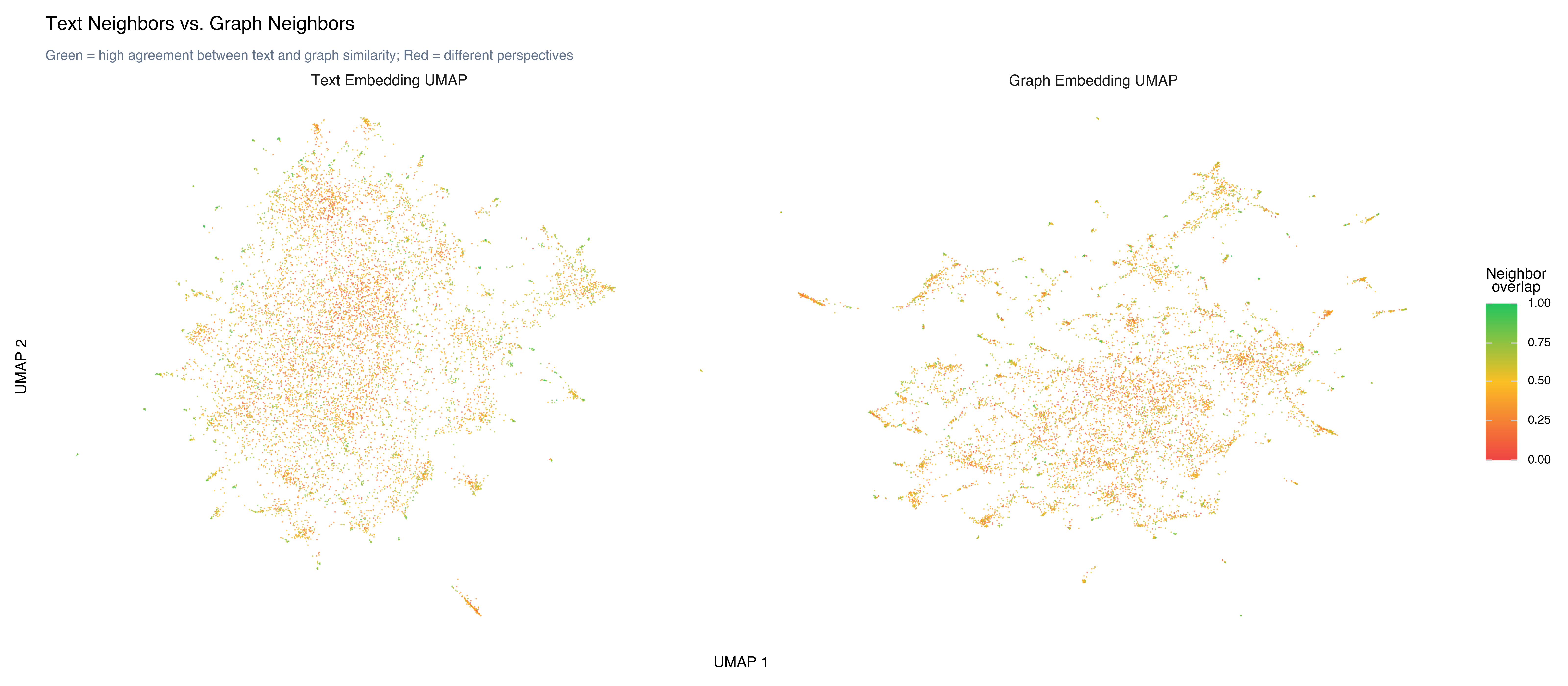
For each review, we compute its 10 nearest neighbors in text embedding space and its 10 nearest neighbors in graph embedding space, then measure the overlap. The mean overlap is 0.46 — just under half. About 34% of reviews have more than 50% overlap, and 1.5% have zero overlap (completely different neighbors in text vs. graph space).
High overlap (reviews where text-neighbors ≈ graph-neighbors): These are reviews that are semantically similar and occupy similar network positions. Typically found in tight, well-defined communities — horror reviews, TV series reviews, sci-fi reviews. When the text is distinctive enough to form a clear genre cluster, the graph agrees.
Low overlap (reviews where neighbors differ): These are the interesting cases. A review might be semantically similar to general drama reviews (text neighbors) but connected to European cinema enthusiasts (graph neighbors) because of shared references to specific directors and films. The text embedding captures what the review says; the graph embedding captures who it’s connected to.
The 46% overlap tells us that the two perspectives agree about half the time — enough to validate each other, but with enough divergence to make the graph genuinely informative. If overlap were 95%, the graph would add nothing. If it were 5%, the two views would be so different that combining them would be confusing. At 46%, they’re complementary.
When Graphs Add Value
Not every dataset benefits from graph analysis. Here’s when it pays off:
Graphs work best when:
- Items have relational structure beyond pairwise similarity (social networks, citation graphs, co-purchase data)
- You want finer-grained communities than density-based clustering provides
- The “big cluster” problem: most of your data falls in one undifferentiated mass, and you need to find sub-structure within it
- You care about roles (hub vs. peripheral, bridge between communities) rather than just group membership
Graphs add less when:
- The data is already well-separated into clean clusters
- You don’t have a meaningful notion of “connection” (beyond the k-NN graph you construct)
- The dataset is small enough that the graph is nearly complete (everyone connects to everyone)
- You need interpretable features more than structural analysis
For our movie review dataset, the graph added the most value for the “everything else” bucket — the 80% of reviews that HDBSCAN couldn’t differentiate. The graph found real structure within that mass because it could detect connection density patterns that don’t show up as spatial density gaps.
The Complete Toolkit
Over seven posts, we’ve built a workflow for exploring high-dimensional data:
Embed: Convert text to dense vectors that capture semantic meaning.
Measure: Check your assumptions with statistics — norms, pairwise distances, the curse of dimensionality.
Project: Reduce to 2D/3D with PCA, t-SNE, or UMAP. Know the tradeoffs.
Explore: Build interactive tools. Rotate, zoom, hover, recolor. Let your visual system do what it’s good at.
Cluster: Formalize the structure you see. Validate with silhouette scores and keyword extraction. Label with cross-encoders and LLMs. Compare with topic models.
Engineer features: Go beyond the embedding. Use structured features as lenses. Understand the concatenation problem and when it works.
Analyze the graph: Build a similarity network. Detect communities. Learn graph embeddings. Compare what the text says to how the network connects.
This workflow — embed, measure, project, explore, cluster, enrich, connect — is how practitioners actually make sense of large datasets. The specific tools change; the process doesn’t.
The art isn’t in knowing the techniques. It’s in knowing which question to ask, choosing the technique that’s designed to answer it, and being clear about what each method can and can’t tell you. Different methods answer different questions: HDBSCAN finds density gaps, Louvain finds connection patterns, NMF decomposes word frequencies, node2vec captures network roles. Each captures something the others miss. Together, they give you a richer understanding than any single approach.
Key Takeaways
Graphs find finer structure than density-based clustering. Louvain community detection on a k-NN graph found 18 communities where HDBSCAN found 7 clusters. The graph subdivides the “everything else” cluster into meaningful groups.
node2vec turns network position into a vector. Just as text embeddings capture semantic similarity, graph embeddings capture structural similarity — which nodes occupy similar roles in the network.
Text neighbors ≠ graph neighbors. When they agree, both signals confirm the same structure. When they disagree, you’ve found something that only one perspective can see.
Degree distribution reveals roles. High-degree nodes are “typical” reviews similar to many others; low-degree nodes are distinctive outliers. This is complementary to cluster membership.
The “everything else” problem has a graph solution. When 80% of your data falls in one cluster, community detection on the similarity graph often finds meaningful sub-structure that spatial clustering misses.
References
- Blondel et al. (2008) — “Fast unfolding of communities in large networks” — The Louvain algorithm
- Grover & Leskovec (2016) — “node2vec: Scalable Feature Learning for Networks” — Graph embedding via biased random walks
- Mikolov et al. (2013) — “Efficient Estimation of Word Representations in Vector Space” — word2vec, the algorithm node2vec builds on
- NetworkX documentation — The Python library for graph analysis
Previous: Feature Engineering — Beyond the Embedding
This is the final post in the Exploring High-Dimensional Data series.