Projecting to See — PCA, t-SNE, UMAP
In the last post, we established that our 50,000 IMDB review embeddings have real structure: pairwise similarities spread widely, sentiment signal is detectable, and the effective dimensionality is around 200 despite the 768-dimensional vectors.
Now we want to see that structure. Which means going from 768 dimensions to 2. And that means choosing how to lie.
All Projections Lie
Here’s the uncomfortable truth about dimensionality reduction: it’s impossible to project 768 dimensions into 2 without losing information. A lot of information. The question isn’t whether the projection distorts the data — it always does. The question is what kind of distortion you’re willing to accept.
Different methods make different choices:
- PCA preserves global variance — the “big picture” of where things are far apart — but flattens curved structure
- t-SNE preserves local neighborhoods — points that are close stay close — but scrambles the global layout
- UMAP tries to preserve both local neighborhoods and some global topology, and does it fast
Let’s apply all three to the same 10,000 IMDB reviews and see what each reveals and hides.
PCA: The Best Flat Map
PCA (principal component analysis) finds the directions of maximum variance in the data and projects onto them. It’s the best linear projection you can make — if you’re forced to compress 768 dimensions into a flat 2D plane, PCA finds the plane that captures the most spread.
I’ve written about PCA in depth in the fixed-income risk series, where it decomposes yield curve movements into shift, twist, and curvature. The mathematics is the same here — only the data is different.
from sklearn.decomposition import PCA

pca = PCA(n_components=2)
coords_2d = pca.fit_transform(embeddings_sample)

print(f"PC1: {pca.explained_variance_ratio_[0]:.1%} variance")
print(f"PC2: {pca.explained_variance_ratio_[1]:.1%} variance")
print(f"Total: {sum(pca.explained_variance_ratio_):.1%}")
PC1: 5.3% variance
PC2: 3.3% variance
Total: 8.6%
Two components capture only 8.6% of the total variance. That’s not much — we’re throwing away over 90% of the information. But PCA is still useful as a baseline: it’s deterministic (run it twice, get the same result), fast, and the axes have interpretable meaning (directions of maximum variance).
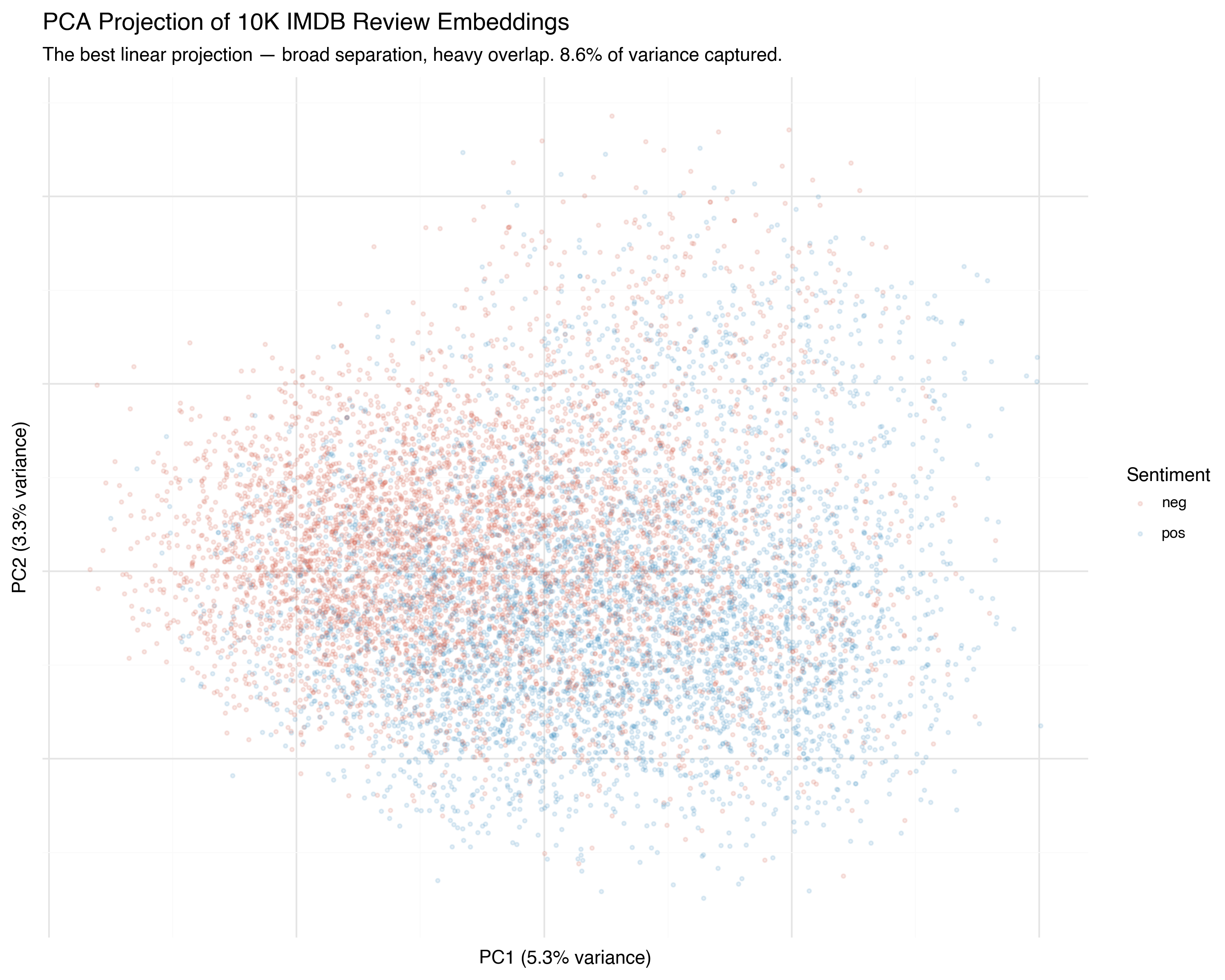
You can see the broad tendency: positive reviews (blue) drift one direction, negative reviews (red) drift the other. But the overlap is enormous. PCA found the best flat plane through the data, but the sentiment boundary isn’t flat — it’s curved through higher dimensions that a linear projection collapses.
It’s like trying to flatten a globe into a map: the projection is geometrically optimal, but Greenland looks the size of Africa.
t-SNE: Preserving Neighborhoods
t-SNE (t-distributed Stochastic Neighbor Embedding, van der Maaten & Hinton, 2008) takes a fundamentally different approach. Instead of preserving global distances, it asks: for each point, can we keep its nearest neighbors close in the projection?
The algorithm works in two steps:
- In high-dimensional space, compute a probability distribution for each point over its neighbors: nearby points get high probability, distant points get low probability
- In 2D, arrange points so that the same probability distributions are matched as closely as possible
The key insight is in the name: the low-dimensional distribution uses a Student-t distribution with heavy tails. This means that in 2D, moderately-distant points can spread far apart without incurring much penalty. The result: clusters in high-D become clearly separated islands in 2D.
from sklearn.manifold import TSNE

tsne = TSNE(
    n_components=2,
    perplexity=30,
    learning_rate="auto",
    init="pca",
    random_state=42,
)
coords_2d = tsne.fit_transform(embeddings_sample)
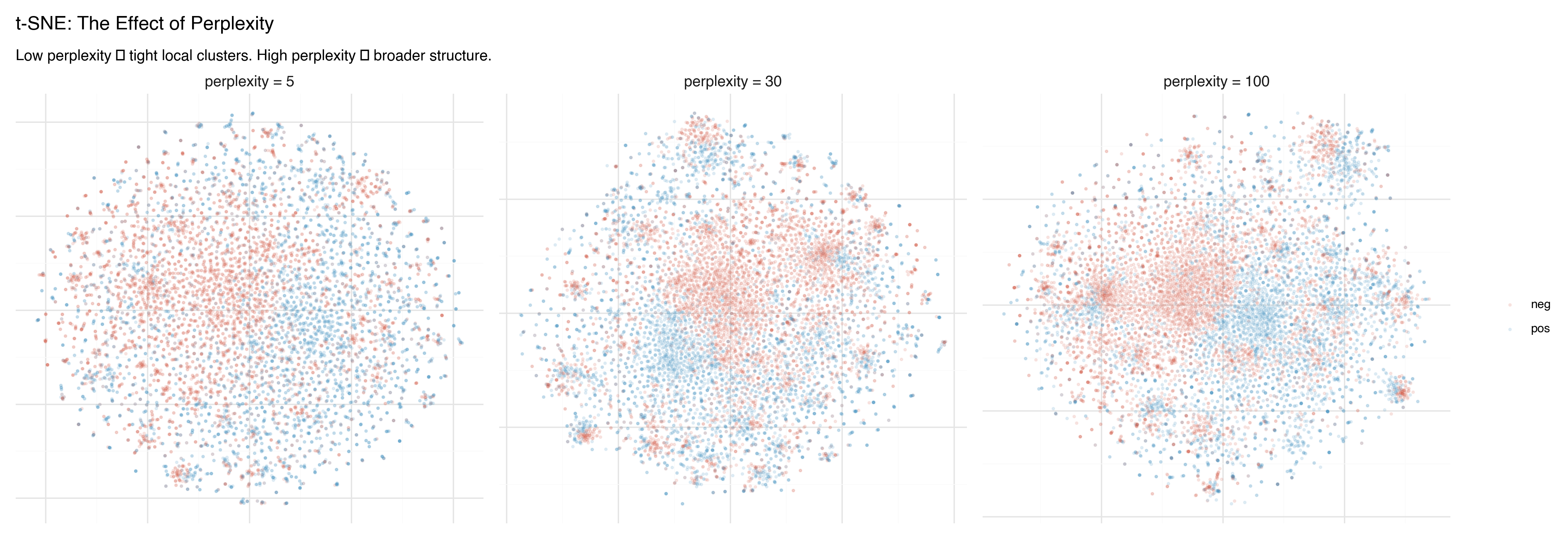
The Perplexity Knob
The perplexity parameter controls how many neighbors each point “cares about.” Low perplexity means each point focuses on its closest neighbors — producing tight, small clusters. High perplexity means each point considers a wider neighborhood — producing broader, more connected structure.
Watch what happens as we turn the knob:
- Perplexity 5: Many tiny, isolated clusters. Fine-grained detail, but hard to see the big picture. Some “clusters” may just be artifacts of the tight focus.
- Perplexity 30: The classic default. A balance between local detail and broader groupings. Most t-SNE plots you see online use this value.
- Perplexity 100: Broader structure emerges. Clusters merge into larger regions. The sentiment separation becomes more visible, but local detail is smoothed away.
The Critical Caveat
Don’t trust the global layout of a t-SNE plot. The distances between clusters are meaningless. t-SNE can rotate, separate, or rearrange clusters arbitrarily between runs. Two clusters that appear far apart in the plot might be neighbors in high-dimensional space. Two clusters that appear adjacent might be unrelated.
Only the within-cluster structure is reliable. If points cluster together in t-SNE, they’re genuinely neighbors in high-dimensional space. But the arrangement of those clusters relative to each other? That’s an artifact.
This is the most common mistake in interpreting t-SNE plots — and it’s pervasive. Papers, blog posts, and conference talks routinely draw conclusions from inter-cluster distances in t-SNE. Don’t do this. (For a thorough treatment, see Wattenberg, Viégas & Johnson’s excellent How to Use t-SNE Effectively on Distill.)
UMAP: Fast and (More) Faithful
UMAP (Uniform Manifold Approximation and Projection, McInnes, Healy & Melville, 2018) has largely supplanted t-SNE as the default nonlinear projection method. It’s faster, scales better, and — crucially — preserves more global structure.
The mathematical foundation is different: UMAP models the data as a fuzzy topological structure (a simplicial complex, if you’re into algebraic topology) and finds a low-dimensional representation that preserves its connectivity. In practice, this means:
- Clusters that are close in high-D tend to stay close in 2D (unlike t-SNE)
- The relative positions of clusters carry some meaning (unlike t-SNE)
- It runs much faster — especially on larger datasets
import umap

reducer = umap.UMAP(
    n_components=2,
    n_neighbors=15,
    min_dist=0.1,
    random_state=42,
)
coords_2d = reducer.fit_transform(embeddings_sample)
UMAP has two key parameters:
n_neighbors: Local vs. Global
The n_neighbors parameter controls the balance between local and global structure — similar to t-SNE’s perplexity, but with more predictable behavior.
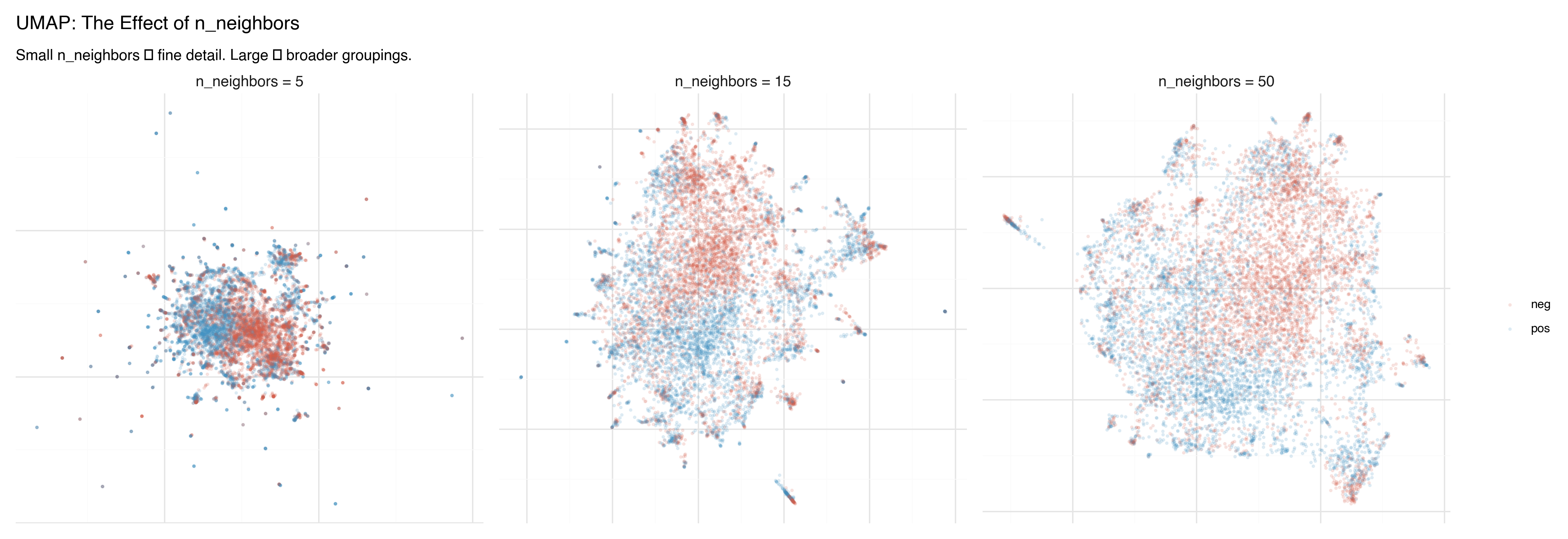
- n_neighbors = 5: Fine local detail. Small, tight clusters. Good for finding sub-structure within groups.
- n_neighbors = 15: The default. A good balance for most datasets.
- n_neighbors = 50: Broader view. Clusters merge into larger regions, inter-cluster relationships become clearer.
min_dist: How Tightly to Pack
The min_dist parameter controls how tightly points can cluster together in the projection.
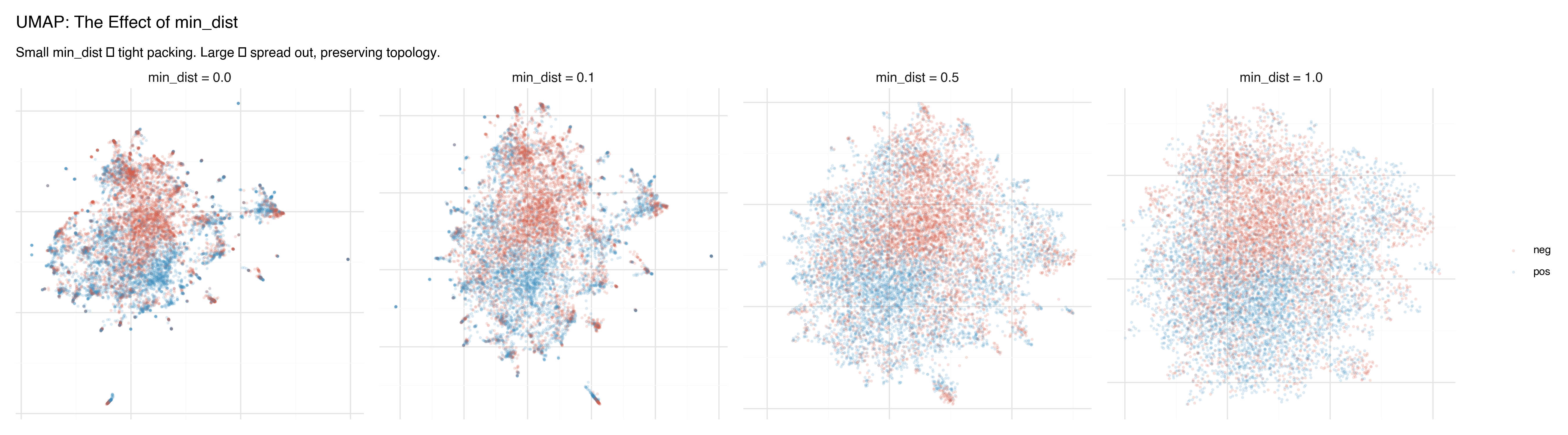
- min_dist = 0.0: Points can land directly on top of each other. Produces dense, tight clusters with clear separation. Good for identifying discrete groups.
- min_dist = 0.1: The default. A slight buffer between points.
- min_dist = 0.5–1.0: Points spread out, preserving more of the continuous topology. Better for seeing gradients and transitions between groups.
Side by Side: Three Lenses on the Same Data
Here are all three methods applied to the same 10,000 IMDB reviews, colored by sentiment:
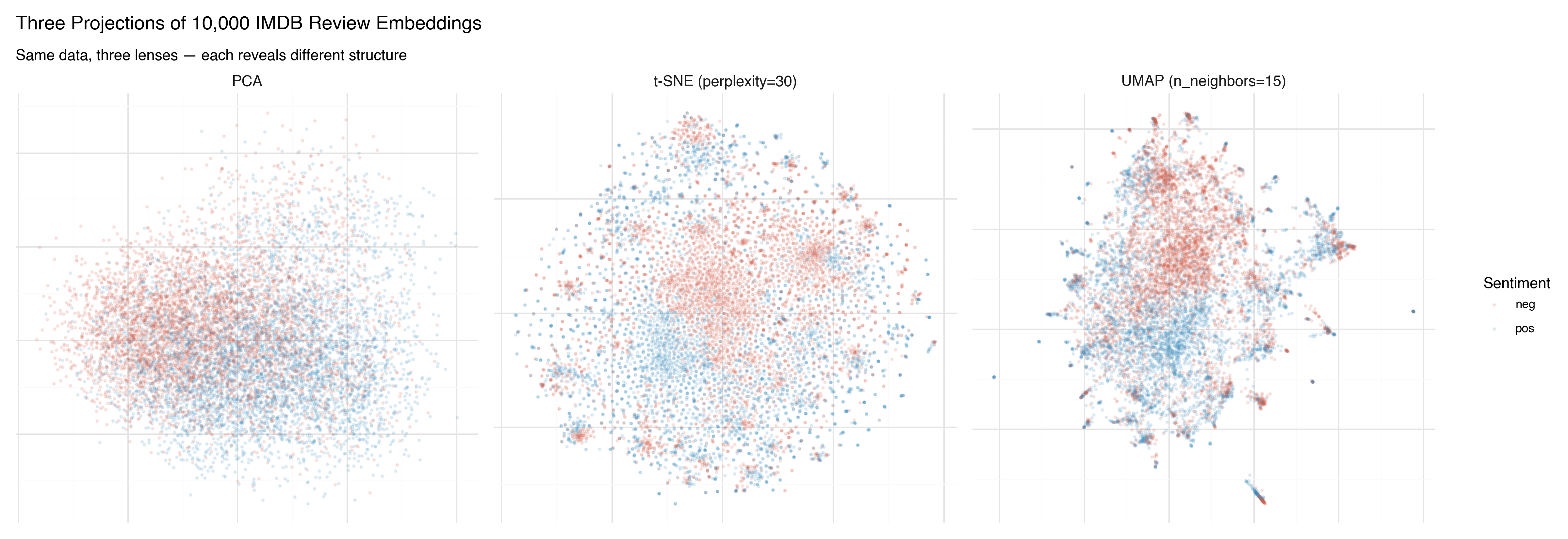
PCA shows the broad strokes. There’s a tendency for positive (blue) and negative (red) reviews to separate, but the overlap is massive. PCA found the best flat plane, and it’s not flat enough.
t-SNE produces dramatic clusters — islands of similar reviews — but the arrangement of those islands is arbitrary. The sentiment separation within clusters is clear, but the spatial relationship between clusters shouldn’t be interpreted.
UMAP finds a middle ground. Clear clusters, like t-SNE, but with spatial relationships that carry some meaning. The positive and negative regions are more coherent, and the boundary between them is visible.
Now the same projections, colored by star rating (1–10) instead of binary sentiment:
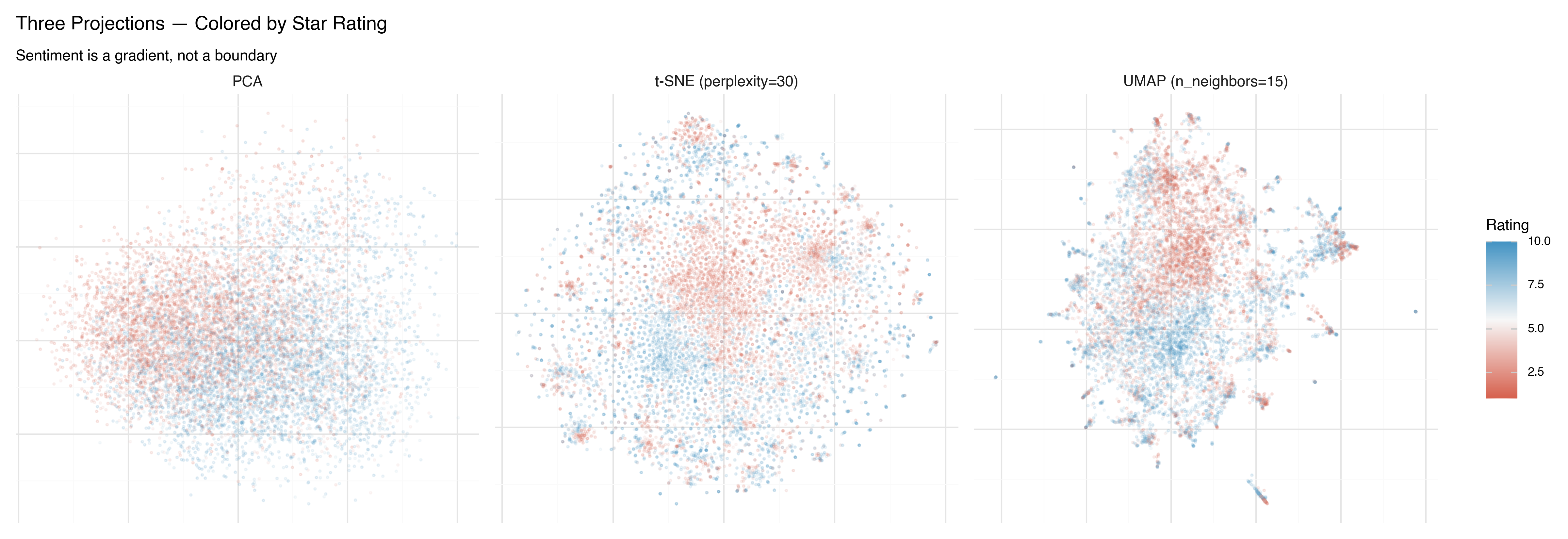
This is more revealing. In all three projections, you can see that sentiment isn’t binary — it’s a gradient. The 1-star reviews (deep red) live in a different region than the 4-star reviews (lighter red), even though both are labeled “negative.” UMAP makes this gradient most visible: there’s a smooth transition from the most negative reviews to the most positive ones.
What Each Method Is Good For
| PCA | t-SNE | UMAP | |
|---|---|---|---|
| Speed | Very fast | Slow (O(n²)) | Fast |
| Deterministic | Yes | No | No |
| Local structure | Poor | Excellent | Excellent |
| Global structure | Best available | Unreliable | Good |
| Cluster distances meaningful? | Yes | No | Somewhat |
| Good for | Quick overview, baseline, preprocessing | Publication-quality cluster visualization | General-purpose exploration |
| Watch out for | Flattens nonlinear structure | Over-interpreting cluster layout | Still distorts; check with multiple parameter settings |
In practice, I almost always start with PCA to get a quick baseline, then switch to UMAP for real exploration. t-SNE is useful when you specifically want to emphasize cluster separation — but UMAP usually gives you that plus more trustworthy spatial layout.
From 2D to 3D
Everything we’ve done so far projects into 2 dimensions. But 2D projections inevitably collapse structure: points that appear overlapped in 2D may be clearly separated in the third dimension.
All three methods support 3D projection. Here’s the difference in variance explained for PCA:
2D PCA: 8.6% variance explained
3D PCA: 11.9% variance explained
That extra dimension adds 40% more captured variance — a significant gain. And for UMAP and t-SNE, the improvement is even more dramatic, because the nonlinear structure that doesn’t fit in a plane often fits naturally in a volume.
The problem with 3D projections is that static images of 3D point clouds are frustrating. You always feel like you need to rotate the view to see what’s behind that cluster, to check whether the overlap is real or just a viewing angle artifact.
What you really want is to grab the point cloud and spin it around. To zoom in on a cluster and read the actual reviews inside it. To change the color scheme and ask a new question of the same spatial arrangement.
In the next post, we build exactly that: an interactive 3D data explorer using Three.js, where you can fly through 10,000 movie reviews and explore the embedding landscape yourself.
Key Takeaways
All projections from 768 to 2 dimensions lose information. The question is what kind of distortion you accept. PCA preserves global structure; t-SNE preserves local neighborhoods; UMAP balances both.
Hyperparameters shape the picture. t-SNE’s perplexity and UMAP’s
n_neighborsandmin_distchange what structure is visible. Always try multiple settings before drawing conclusions.Don’t trust inter-cluster distances in t-SNE. Within-cluster structure is reliable; the layout of clusters relative to each other is not. This is the single most common mistake in interpreting these plots.
UMAP is usually the best starting point for exploration. It’s fast, preserves both local and global structure reasonably well, and produces interpretable spatial layouts.
3D projections capture more structure than 2D — but static images of 3D data are deeply unsatisfying. Interactive visualization is the answer.
References
- van der Maaten & Hinton (2008) — “Visualizing Data using t-SNE”
- McInnes, Healy & Melville (2018) — “UMAP: Uniform Manifold Approximation and Projection for Dimension Reduction”
- Wattenberg, Viégas & Johnson (2016) — “How to Use t-SNE Effectively” — Essential reading on t-SNE pitfalls
- What PCA Actually Does — Deep dive on PCA from the fixed-income risk series