Exploring Treasury Yield Data with Python
From 2003 to 2010, I worked at The Capital Group Companies in fixed income. I started as an analyst, earned the CFA charter along the way, and eventually became a Quantitative Research Associate — a path made possible by generous colleagues and mentors who were willing to explain things patiently, point me toward the right papers, and let me make (recoverable) mistakes with real models.
During those years I learned about bond math and about risk management. This series is my attempt to translate some of that knowledge into a form that’s useful for software developers and data scientists who might not have a finance background but who know their way around Python.
We’re going to build up a practical toolkit for understanding and measuring interest rate risk. We won’t assume you know anything about bonds. We will assume you know pandas, numpy, and matplotlib. If you can wrangle a DataFrame, you’re good to go.
Let’s start with the data.
What Are Treasury Yields, and Why Should You Care?
US Treasury bonds are debt instruments issued by the federal government. When you hear “the 10-year yield is at 4.5%,” it means that if you buy a 10-year Treasury bond right now, you’ll earn about 4.5% per year on your investment.
But yields don’t sit still. They move every trading day in response to:
- Federal Reserve policy — when the Fed raises or lowers short-term rates
- Inflation expectations — higher expected inflation pushes yields up
- Economic growth outlook — recession fears push yields down (flight to safety)
- Supply and demand — government borrowing needs, foreign buyer appetite
These movements create risk for anyone holding bonds. If you bought a bond at 4% yield and yields suddenly jump to 5%, your bond just lost value. The question is: how much can yields move, and how do we measure that risk?
That’s the core of this series. If you understand the way that bond yields behave, you can build a portfolio that is robust to the risks that are most relevant to you.
If you’re interested in buying and selling Treasury bonds, you can do so directly from the Treasury Department’s Treasury Direct website.
Getting the Data
We’ll pull historical daily yields for the 10-year US Treasury from FRED (Federal Reserve Economic Data), the gold standard for economic time series. The series code is DGS10.
import pandas as pd
import numpy as np
import matplotlib.pyplot as plt
from datetime import datetime

# Fetch 30 years of 10-year Treasury yield data directly from FRED's CSV endpoint
# No API key needed — this is FRED's public download interface
start, end = '1995-01-01', '2026-01-01'
url = f"https://fred.stlouisfed.org/graph/fredgraph.csv?id=DGS10&cosd={start}&coed={end}"

df = pd.read_csv(url, index_col=0, parse_dates=True, na_values='.')
df.columns = ['yield_pct']
df.dropna(inplace=True)

# Compute daily yield changes in basis points (1 bp = 0.01%)
df['change_bp'] = df['yield_pct'].diff() * 100.0

print(f"Date range: {df.index.min().date()} to {df.index.max().date()}")
print(f"Observations: {len(df):,}")
print(f"\nYield range: {df['yield_pct'].min():.2f}% to {df['yield_pct'].max():.2f}%")
This gives us roughly 7,800 trading days of data — enough to cover multiple economic cycles, crises, and regime changes.
Why basis points? A basis point is 1/100th of a percentage point. When I started in fixed income, one of the first things I had to internalize was that nobody says “yields moved 0.15 percentage points” — they say “yields moved 15 basis points.” It’s cleaner, less ambiguous, and universal. You’ll see
bps(pronounced “bips”) everywhere in this series and anywhere bond people gather.
Data access: We’re using FRED’s public CSV endpoint directly — no API key required. You can also browse the data interactively at https://fred.stlouisfed.org/series/DGS10.
Visualizing Three Decades of Yields
Let’s start with the big picture — what has the 10-year yield done over the last 30 years?
fig, ax = plt.subplots(figsize=(12, 6))
ax.plot(df.index, df['yield_pct'], color='#2c3e50', linewidth=0.8)
ax.set_title('10-Year US Treasury Yield (1995–2025)', fontweight='bold', fontsize=14)
ax.set_ylabel('Yield (%)')
ax.set_ylim(0, 8.5)
ax.grid(True, alpha=0.3)
plt.tight_layout()
plt.show()
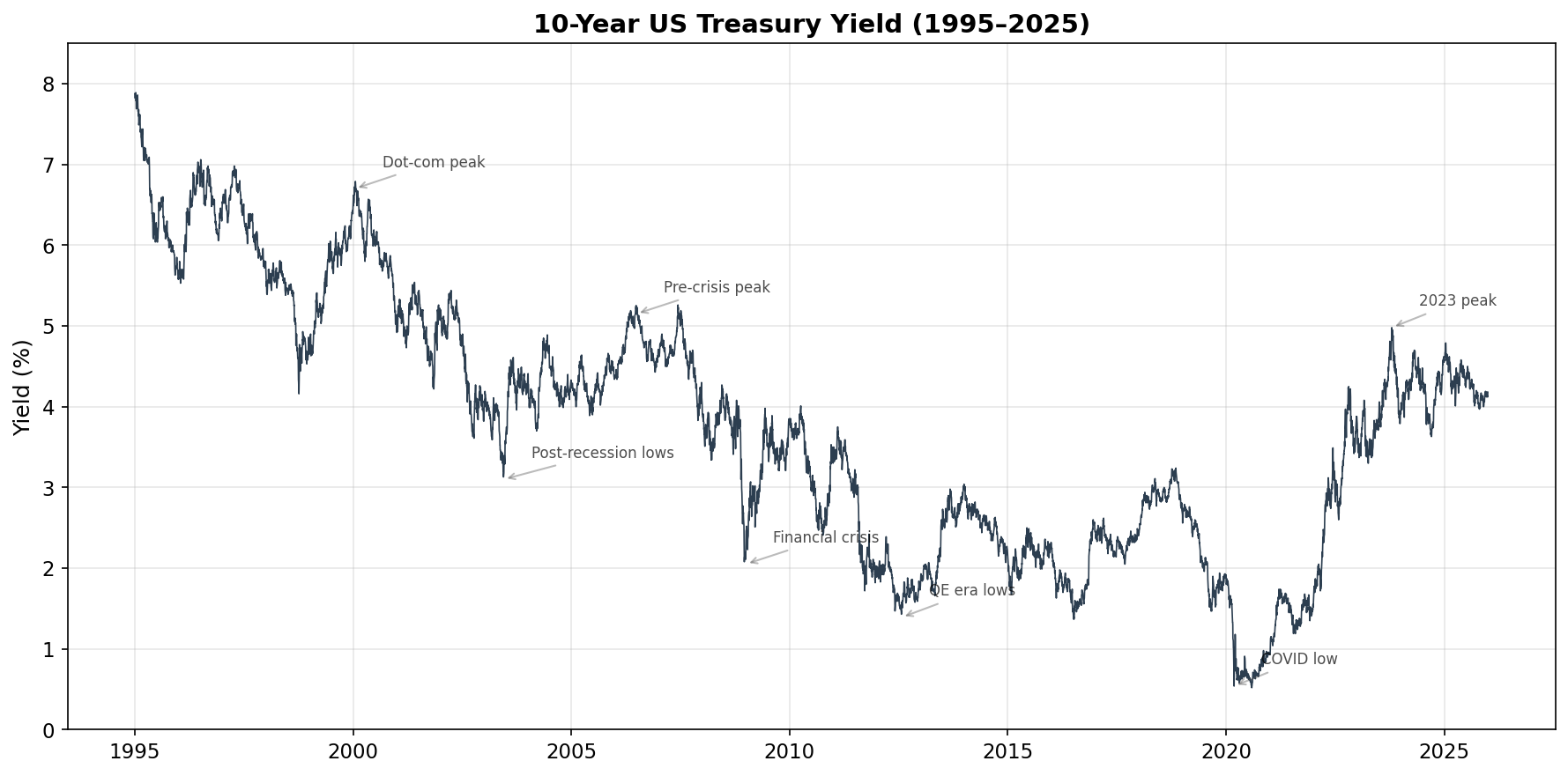
A few things jump out immediately:
The long decline. Yields fell from ~7.8% in 1995 to a COVID-era low below 0.6% in 2020. This 25-year bull market in bonds was driven by declining inflation, globalization, and aggressive Fed easing after each crisis.
Crisis drops. Notice the sharp dips during the 2001 recession, the 2008 financial crisis, and especially March 2020 — investors piled into Treasuries as a safe haven, pushing yields down rapidly.
The 2022 reversal. After the COVID lows, yields shot back up as the Fed raised rates aggressively to fight inflation. The 10-year yield went from ~1.5% to nearly 5% in under two years — the sharpest rate-rise cycle in decades.
When I joined Capital Group in 2003, the 10-year was around 4%. By the time I left in 2010, it had been as high as 5.2% and as low as 2.1%. That full range — a swing of over 300 basis points — happened in the span of seven years. If you’re used to working with stock prices, note the difference: stocks are non-stationary (they trend upward over the long run), while interest rates tend to mean-revert over very long horizons. This will matter when we start modeling.
The Distribution of Daily Changes
Now let’s look at the daily changes — this is where risk analysis really lives. We care less about the level of yields and more about how much they move day-to-day.
changes = df['change_bp'].dropna()

fig, ax = plt.subplots(figsize=(10, 6))

# Histogram of daily changes
ax.hist(changes, bins=100, density=True, color='#3498db', alpha=0.7,
        edgecolor='white', linewidth=0.5)

# Overlay a normal distribution with the same mean and std dev
mu, sigma = changes.mean(), changes.std()
x = np.linspace(changes.min(), changes.max(), 200)
normal_pdf = (1 / (sigma * np.sqrt(2 * np.pi))) * np.exp(-0.5 * ((x - mu) / sigma) ** 2)
ax.plot(x, normal_pdf, color='#e74c3c', linewidth=2,
        label=f'Normal(μ={mu:.1f}, σ={sigma:.1f} bps)')

# Stats box
stats_text = (f"Mean: {mu:.2f} bps\nStd Dev: {sigma:.2f} bps\n"
              f"Skewness: {changes.skew():.2f}\nKurtosis: {changes.kurtosis():.2f}")
ax.text(0.97, 0.95, stats_text, transform=ax.transAxes, fontsize=9,
        va='top', ha='right',
        bbox=dict(boxstyle='round,pad=0.5', facecolor='wheat', alpha=0.8))

ax.set_title('Distribution of Daily 10-Year Yield Changes', fontweight='bold')
ax.set_xlabel('Daily Change (basis points)')
ax.set_ylabel('Density')
ax.legend(loc='upper left')
plt.tight_layout()
plt.show()
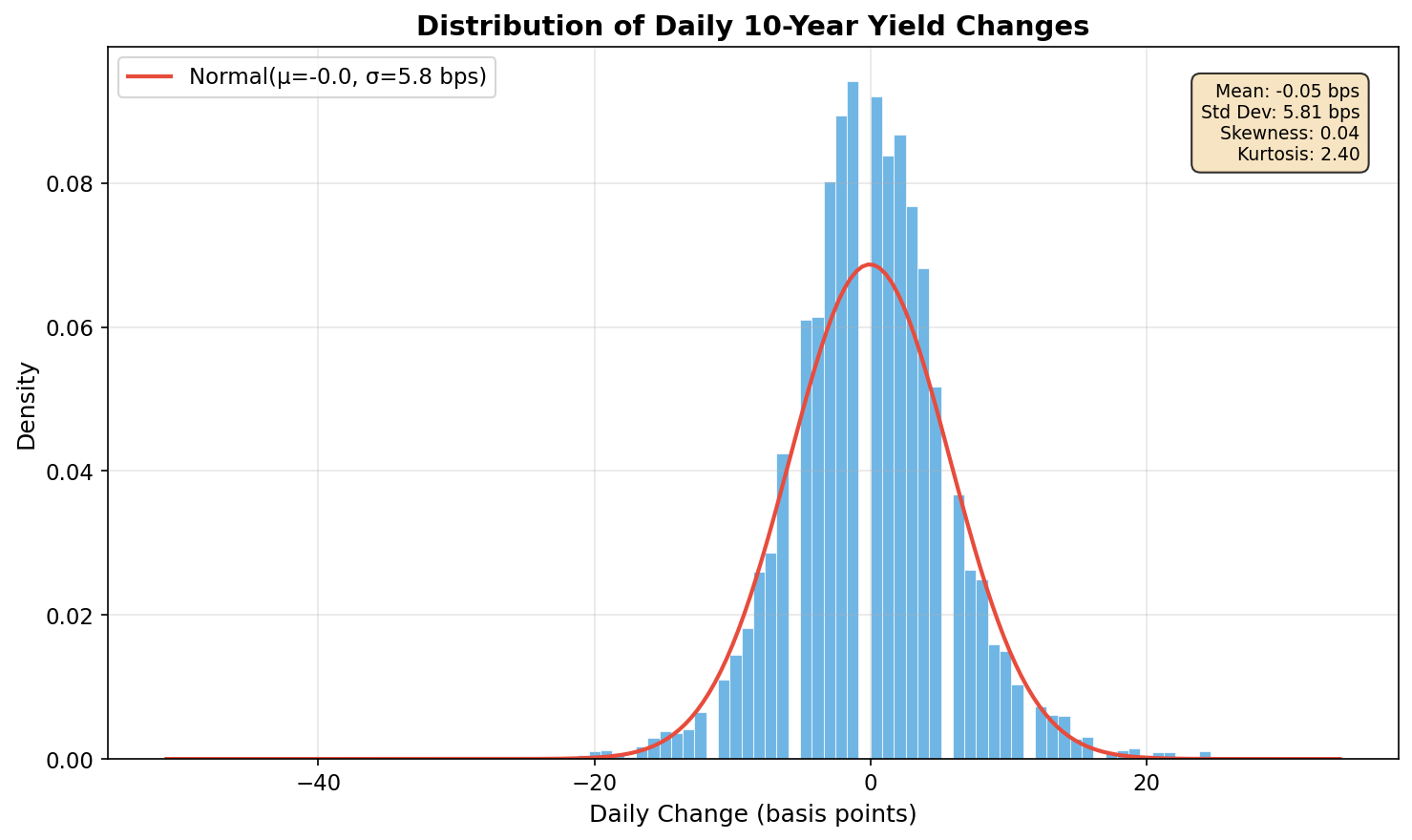
This chart reveals something crucial: yield changes are not normally distributed. Look carefully at the differences:
- The peak is taller and sharper than the red normal curve — more days have very small moves than a Gaussian would predict.
- The tails are fatter — extreme moves (beyond ±20 bps) happen far more often than a normal distribution implies.
- The kurtosis (a measure of tail heaviness) is typically 10–15 for yield changes, well above the normal distribution’s value of 3.
This “fat tails” phenomenon is well-documented in finance, but it has real consequences. If you use a normal distribution to estimate risk, you’ll systematically underestimate the probability of extreme events. A move that “should” happen once every 100 years under normal assumptions might actually show up once a decade. I can tell you that when you’re sitting on a trading desk and a “six sigma” event happens for the third time in a month, the normal distribution stops feeling like a reasonable assumption very quickly.
We’ll address this directly when we build a GARCH model.
Volatility Isn’t Constant
Here’s the other key insight that will drive everything in this series. Let’s plot the 30-day rolling standard deviation of daily changes:
rolling_vol = changes.rolling(window=30).std()

fig, ax = plt.subplots(figsize=(12, 5))
ax.fill_between(rolling_vol.index, 0, rolling_vol, color='#e74c3c', alpha=0.4)
ax.plot(rolling_vol.index, rolling_vol, color='#c0392b', linewidth=0.8)
ax.set_title('30-Day Rolling Volatility of Daily Yield Changes', fontweight='bold')
ax.set_ylabel('Standard Deviation (bps)')
ax.grid(True, alpha=0.3)
plt.tight_layout()
plt.show()
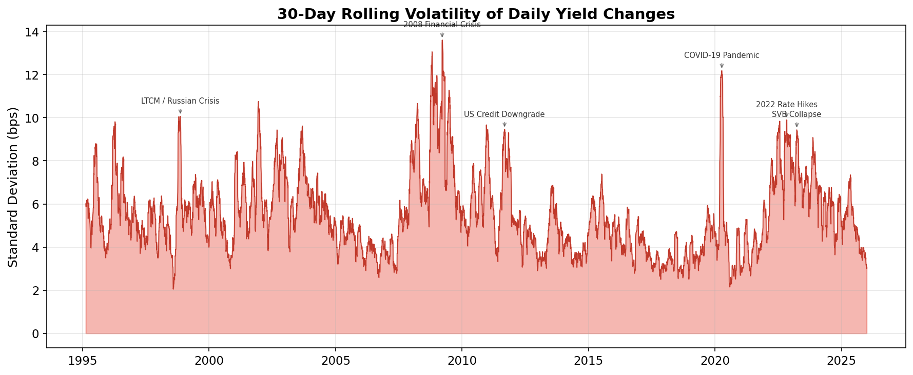
Volatility is emphatically not constant. It clusters — long quiet periods punctuated by bursts of intense activity:
| Period | Event | What Happened to Vol |
|---|---|---|
| 1998 | LTCM collapse, Russian default | Sharp spike — Treasury yields whipsawed as the “flight to quality” reversed and re-reversed |
| 2001 | 9/11 attacks, recession | Elevated for months — extreme uncertainty about economic trajectory |
| 2008–09 | Global financial crisis | The big one — sustained peak as credit markets froze and the Fed intervened massively |
| 2013 | “Taper tantrum” | Brief spike — the Fed hinted it might slow bond purchases |
| 2020 | COVID-19 pandemic | Sharp, brief spike — the fastest yield collapse in history |
| 2022 | Fed rate-hiking cycle | Prolonged elevation — each Fed meeting and inflation print moved markets |
This pattern — calm periods followed by turbulent ones — is called volatility clustering. It’s one of the most robust empirical findings in financial markets, and it means that yesterday’s volatility is a strong predictor of today’s.
For a software developer, think of it like this: if your web service had a spike in error rates yesterday, you’d expect elevated error rates today too. The errors cluster. Same with financial volatility — except the consequences of ignoring it involve real money.
Two Inconvenient Truths
Let’s summarize what we’ve found:
Fat tails: Extreme daily yield moves happen much more often than a normal distribution predicts. The “once in a century” event shows up every few years.
Volatility clustering: The standard deviation of daily changes isn’t a fixed number — it changes over time, with quiet and turbulent regimes. A single, static risk estimate is the wrong tool.
Both of these facts mean that simple approaches — “yields typically move ±6 bps per day” — are dangerously incomplete. During the 2008 crisis, daily moves of 30–40 bps were common. During the quiet years around 2012, even a 5 bps move was unusual.
We need a model that:
- Lets volatility change over time based on recent market behavior
- Provides a dynamic risk estimate that widens during crises and narrows during calm periods
- Is simple enough to implement in a few lines of Python
What’s Next
In the next post, we’ll build up to GARCH step by step — starting from the simplest possible time series model and showing why each successive idea exists. Then in the post after that, we’ll apply GARCH to Treasury yields, construct a dynamic 95% Value-at-Risk envelope, and investigate whether the days where yields moved more than the model expected correspond to known financial crises like LTCM, 9/11, the 2008 crash, or COVID.
Spoiler: they overwhelmingly do.