When Markets Panic — Modeling Volatility with GARCH
In the first post in this series, we explored 30 years of 10-year Treasury yield data and discovered two inconvenient truths for anyone trying to measure risk: daily yield changes have fat tails and non-constant volatility. A fixed “normal” model would badly underestimate extreme moves during crises and overestimate them during quiet periods.
Enter GARCH — Generalized Autoregressive Conditional Heteroskedasticity. The name is a mouthful, but the idea is elegant: let yesterday’s volatility inform today’s estimate. In this post, we’ll fit a GARCH model to Treasury yields, build a dynamic 95% VaR envelope, and then investigate what happens when yields breach that envelope. Were those extreme days random noise, or do they cluster around known financial crises?
GARCH in 60 Seconds
If you want the full story of why GARCH exists — the step-by-step progression from simple averages through AR, ARIMA, and ARCH — see the explainer post. What follows is a quick recap so this post stands on its own.
If you’ve worked with time series, you’re probably familiar with ARIMA models. ARIMA captures patterns in the level of a series, but it assumes the variance of the noise is constant over time. GARCH flips the focus: it models the variance itself as a time-varying process.
A GARCH(1,1) model says:
Today’s variance = baseline + (weight on yesterday’s surprise²) + (weight on yesterday’s variance)
More precisely:
σ²_t = ω + α · ε²_{t-1} + β · σ²_{t-1}
Where:
σ²_tis today’s conditional variance (what we’re estimating)ε²_{t-1}is yesterday’s squared innovation — how far the actual move was from the meanσ²_{t-1}is yesterday’s variance estimateω,α,βare parameters estimated from data
In plain English: today’s expected volatility is a weighted combination of a long-run baseline (ω), yesterday’s shock (α · ε²), and yesterday’s volatility (β · σ²).
The key insight is in α + β. When this sum is close to 1 — and for financial data it almost always is (typically 0.98–0.99) — volatility is highly persistent. A big shock doesn’t just spike volatility for one day; it keeps it elevated for weeks or months. That’s exactly the clustering pattern we saw in the previous post.
Why Not Just Use Rolling Standard Deviation?
Good question. A 30-day rolling window (like we used earlier) does capture changing volatility, but it has drawbacks:
- It weights all 30 days equally — a huge shock 29 days ago counts the same as one yesterday
- The window size is arbitrary — why 30 days instead of 20 or 60?
- It responds sluggishly to sudden regime changes
GARCH weights recent observations more heavily (through the exponential decay structure of β), adapts its effective “memory” based on the data, and has a clean probabilistic interpretation that lets us derive VaR directly.
Fitting GARCH to Treasury Yields
Let’s fit the model using the arch library, the standard Python package for GARCH-family models:
import pandas as pd
import numpy as np
import matplotlib.pyplot as plt
from datetime import datetime
from arch import arch_model

# Fetch data (same as the first post)
start, end = '1995-01-01', '2026-01-01'
url = f"https://fred.stlouisfed.org/graph/fredgraph.csv?id=DGS10&cosd={start}&coed={end}"
df = pd.read_csv(url, index_col=0, parse_dates=True, na_values='.')
df.columns = ['yield_pct']
df.dropna(inplace=True)
df['change_bp'] = df['yield_pct'].diff() * 100.0
yield_changes = df['change_bp'].dropna()

# Fit GARCH(1,1) with zero-mean assumption
am = arch_model(yield_changes, vol='GARCH', p=1, q=1,
                dist='normal', mean='zero')
res = am.fit(update_freq=10, disp='off')
print(res.summary())
Why
mean='zero'? The average daily change in the 10-year yield is tiny — around 0.01 bps — compared to the standard deviation (~6 bps). Modeling a near-zero mean adds complexity without improving the volatility estimate, so we simplify by assuming mean zero.
Let’s inspect the fitted parameters:
omega = res.params['omega']
alpha = res.params['alpha[1]']
beta = res.params['beta[1]']

print(f"ω (omega):  {omega:.6f}  — long-run variance contribution")
print(f"α (alpha):  {alpha:.4f}    — weight on yesterday's shock")
print(f"β (beta):   {beta:.4f}    — weight on yesterday's volatility")
print(f"α + β:      {alpha + beta:.4f}    — persistence")
print(f"Half-life:  {np.log(2) / -np.log(alpha + beta):.0f} days"
      f"  — time for a vol shock to decay by half")
Typical results for Treasury yields:
- α ≈ 0.04–0.05 — recent shocks get about 5% weight
- β ≈ 0.95 — yesterday’s volatility gets about 95% weight
- α + β ≈ 0.99 — extremely persistent
- Half-life ≈ 70 days — after a volatility spike, it takes about 2–3 months to decay halfway back to normal
This matches intuition perfectly: after a crisis hits, markets don’t calm down overnight. The elevated volatility persists for months before gradually fading.
A Note on Model Choices
We chose GARCH(1,1) with a normal distribution for simplicity. There are many variants:
| Model | What It Adds | When to Use It |
|---|---|---|
| GARCH(1,1) + Student-t | Heavier tails in the error distribution | When normal underestimates extreme events (common) |
| EGARCH | Allows asymmetric responses (negative shocks → more vol than positive) | Equities (the “leverage effect”). Less critical for rates |
| GJR-GARCH | Another asymmetric formulation | Similar use case to EGARCH |
| GARCH(2,1) | More lags in the variance equation | Rarely needed in practice |
For interest rates, GARCH(1,1) is a solid starting point. Treasury yields don’t exhibit the strong asymmetry (negative returns → higher vol) that equities do. If you want more accurate tail behavior, switching to dist='t' (Student-t errors) is the single most impactful upgrade.
Visualizing Conditional Volatility
The fitted model produces a conditional volatility estimate for every day in our sample — the model’s real-time assessment of how volatile the market is:
cond_vol = res.conditional_volatility  # in basis points

fig, ax = plt.subplots(figsize=(12, 5))
ax.plot(cond_vol.index, cond_vol, color='#8e44ad', linewidth=0.8)
ax.fill_between(cond_vol.index, 0, cond_vol, color='#9b59b6', alpha=0.3)
ax.set_title('GARCH(1,1) Conditional Volatility', fontweight='bold')
ax.set_ylabel('Conditional Std Dev (bps)')
ax.grid(True, alpha=0.3)
plt.tight_layout()
plt.show()
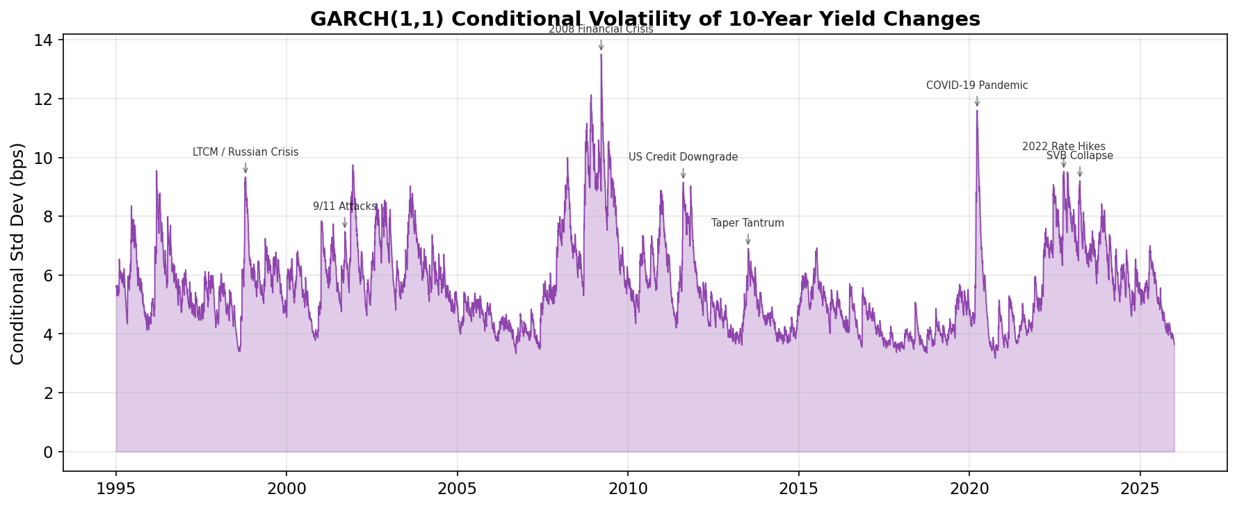
The peaks tell a story of three decades of financial stress. The model “learns” from recent data that during crises, you should expect much larger daily moves — and it ratchets up the volatility estimate accordingly.
Compare this to the rolling standard deviation from the first post: the shape is similar, but GARCH responds faster to sudden shocks and decays more smoothly afterward. That’s the benefit of the parametric structure.
Building the 95% VaR Envelope
Value-at-Risk (VaR) answers a simple question: What’s the worst daily move we should expect on 95% of trading days?
For a zero-mean normal distribution, the 95% two-tailed confidence band is ±1.645 standard deviations. With GARCH, the standard deviation changes every day, so the band is dynamic:
# Dynamic VaR from GARCH
var_hi = 1.645 * cond_vol
var_lo = -1.645 * cond_vol

# Static VaR (simple historical percentile)
static_threshold = yield_changes.quantile(0.975)  # 2.5% in each tail

print(f"Static 95% VaR: ±{static_threshold:.1f} bps (constant for all days)")
print(f"Dynamic VaR range: ±{var_hi.min():.1f} to ±{var_hi.max():.1f} bps")
Let’s plot them together, zoomed into the 2008 financial crisis to see the difference clearly:
fig, ax = plt.subplots(figsize=(12, 6))

# Focus on 2007–2009
mask = (yield_changes.index >= '2007-01-01') & (yield_changes.index <= '2010-01-01')
yc = yield_changes[mask]
vh, vl = var_hi[mask], var_lo[mask]

ax.plot(yc.index, yc, color='#2c3e50', linewidth=0.8, label='Daily Change')
ax.fill_between(vh.index, vl, vh, color='#f39c12', alpha=0.3,
                label='GARCH 95% VaR Band')
ax.axhline(static_threshold, color='#e74c3c', ls='--', lw=1, alpha=0.6,
           label=f'Static ±{static_threshold:.0f} bps')
ax.axhline(-static_threshold, color='#e74c3c', ls='--', lw=1, alpha=0.6)

# Mark breach points
breaches = yc[yc.abs() > vh]
ax.scatter(breaches.index, breaches, color='#e74c3c', s=30, zorder=5,
           label=f'VaR Breaches ({len(breaches)})')

ax.set_title('2007–2009: Financial Crisis — GARCH VaR Envelope', fontweight='bold')
ax.set_ylabel('Daily Change (bps)')
ax.legend(loc='upper left', fontsize=9)
plt.tight_layout()
plt.show()
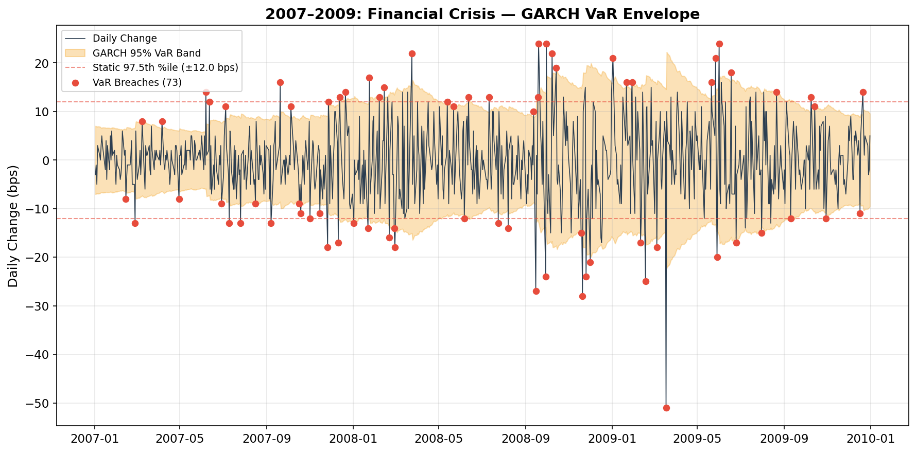
Two things stand out:
The static band (red dashes) gets destroyed. During the peak of the crisis, daily moves of 20–40 bps were common — far beyond a static ±10 bps threshold. A fixed VaR would trigger breach alerts nearly every day.
The GARCH band (orange) adapts. It widens dramatically during the crisis, correctly anticipating that big moves beget more big moves. Even with the wider band, about 5% of days still breach it — exactly as designed.
This is the entire point of conditional volatility modeling: consistent risk coverage across different market regimes. The static VaR is overconfident during crises and overly conservative during calm periods. GARCH adapts.
The Forensics: What Were Those Breach Days?
Here’s where it gets really interesting. Let’s identify every day where the actual yield move exceeded the GARCH 95% VaR, across the entire 30-year sample, and check whether those days correspond to known financial crises.
First, we define crisis windows:
CRISIS_EVENTS = [
    ("LTCM / Russian Crisis",      "1998-07-01", "1998-11-30"),
    ("9/11 Attacks",                "2001-09-10", "2001-10-31"),
    ("2008 Financial Crisis",       "2007-08-01", "2009-06-30"),
    ("US Credit Downgrade",         "2011-07-15", "2011-10-31"),
    ("Taper Tantrum",               "2013-05-01", "2013-09-30"),
    ("COVID-19 Pandemic",           "2020-02-15", "2020-06-30"),
    ("2022 Rate Hikes",             "2022-01-01", "2022-12-31"),
    ("SVB Collapse",                "2023-03-01", "2023-04-30"),
]
These windows are deliberately generous — we want to capture the full turbulence period around each event, not just the single worst day.
Now let’s classify every VaR breach:
# Dynamic VaR threshold for each day
var_threshold = 1.645 * cond_vol

# Identify breach days
breach_mask = yield_changes.abs() > var_threshold
breach_dates = yield_changes[breach_mask]

print(f"Total trading days:   {len(yield_changes):,}")
print(f"Total VaR breaches:   {len(breach_dates):,} "
      f"({len(breach_dates)/len(yield_changes)*100:.1f}%)")

# Label each breach
breach_df = pd.DataFrame({'change_bp': breach_dates, 'event': 'Non-crisis'})

for name, start_date, end_date in CRISIS_EVENTS:
    mask = (breach_df.index >= start_date) & (breach_df.index <= end_date)
    breach_df.loc[mask, 'event'] = name

# Summary
summary = breach_df.groupby('event').agg(
    count=('change_bp', 'size'),
    max_abs_move=('change_bp', lambda x: x.abs().max()),
    first_date=('change_bp', lambda x: x.index.min().strftime('%Y-%m-%d')),
    last_date=('change_bp', lambda x: x.index.max().strftime('%Y-%m-%d'))
).sort_values('count', ascending=False)

summary['pct_of_total'] = (summary['count'] / len(breach_df) * 100).round(1)
print("\n", summary.to_string())
The Results
The first thing that jumps out: about 9.3% of days breach the 95% VaR — nearly double the 5% we’d expect if the model were perfectly calibrated. This itself is important: it confirms what we saw in the histogram earlier in this series. The normal distribution assumption underestimates tail risk for yield changes. (Using a Student-t distribution would fix this — more on that later.)
Now, the crisis breakdown:
| Event | Breaches | % of All | Largest Move (bps) |
|---|---|---|---|
| 2008 Financial Crisis | 54 | 7.5% | 51 |
| 2022 Rate Hikes | 32 | 4.5% | 30 |
| Taper Tantrum | 13 | 1.8% | 21 |
| LTCM / Russian Crisis | 11 | 1.5% | 22 |
| US Credit Downgrade | 10 | 1.4% | 20 |
| COVID-19 Pandemic | 10 | 1.4% | 29 |
| SVB Collapse | 5 | 0.7% | 23 |
| 9/11 Attacks | 2 | 0.3% | 20 |
| Non-crisis | 582 | 80.9% | 34 |
About 19% of all VaR breaches fall within our defined crisis windows. But here’s why that number understates the story: those crisis windows represent only about 15% of all trading days, yet they generate disproportionately more breaches and much larger ones — the 2008 crisis produced moves of up to 51 bps in a single day.
Let’s visualize this by color-coding every breach on the full time series:
fig, ax = plt.subplots(figsize=(14, 7))

# Background: all yield changes in gray
ax.plot(yield_changes.index, yield_changes, color='#bdc3c7', linewidth=0.3, alpha=0.5)

# Light VaR band
ax.fill_between(cond_vol.index, -1.645*cond_vol, 1.645*cond_vol,
                color='#f39c12', alpha=0.1)

# Color-coded breaches
colors = ['#e74c3c', '#e67e22', '#c0392b', '#8e44ad',
          '#2980b9', '#27ae60', '#f39c12', '#1abc9c']

for (name, start_date, end_date), color in zip(CRISIS_EVENTS, colors):
    group = breach_df[breach_df['event'] == name]
    if len(group) > 0:
        ax.scatter(group.index, group['change_bp'], color=color, s=20,
                   label=f'{name} ({len(group)})', zorder=5)

# Non-crisis breaches in gray
non_crisis = breach_df[breach_df['event'] == 'Non-crisis']
ax.scatter(non_crisis.index, non_crisis['change_bp'], color='#95a5a6', s=10,
           alpha=0.5, label=f'Non-crisis ({len(non_crisis)})', zorder=4)

ax.set_title('VaR Breaches Annotated by Financial Crisis', fontweight='bold')
ax.set_ylabel('Daily Yield Change (bps)')
ax.legend(loc='upper left', fontsize=8, ncol=2)
plt.tight_layout()
plt.show()
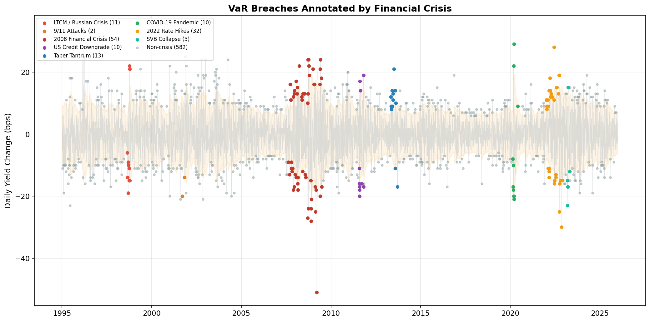
The clustering is unmistakable. Extreme moves are not independent events. They come in waves, and those waves correspond to real-world financial stress.
Crisis Deep-Dive: The Hall of Fame
LTCM / Russian Crisis (July–November 1998)
In August 1998, Russia defaulted on its domestic debt and devalued the ruble. The shock wave rippled through global bond markets and hit Long-Term Capital Management (LTCM), a massively leveraged hedge fund that had bet on convergence of bond spreads. As LTCM was forced to unwind $125 billion in positions, Treasury yields whipsawed violently. Multiple days saw moves of 15–20+ bps.
The LTCM crisis happened five years before I entered the industry, but its aftermath shaped the risk culture I was trained in. Senior colleagues at Capital Group would reference it as the canonical example of model overconfidence — brilliant people using sophisticated models who convinced themselves that extreme tail events wouldn’t happen, right up until they did.
2008 Financial Crisis (August 2007–June 2009)
The mother of all volatility regimes. After Lehman Brothers filed for bankruptcy on September 15, 2008, credit markets froze. Treasury yields swung wildly — sometimes dropping 30+ bps in a day as panicked investors bought Treasuries, then reversing the next day on rumors of government intervention.
COVID-19 Pandemic (February–June 2020)
The fastest bear-to-bull transition in Treasury history. The 10-year yield fell from ~1.9% to 0.5% in about three weeks — an unprecedented speed. Then something bizarre happened: even Treasuries — supposedly the most liquid market in the world — experienced liquidity problems. The Fed responded with the most aggressive intervention in its history, announcing unlimited bond purchases.
2022 Rate Hikes (January–December 2022)
Unlike the sudden shocks above, the 2022 VaR breaches came from a sustained regime shift. The Fed raised rates from near zero to over 5% to combat the highest inflation in 40 years. This period had fewer single-day extremes than 2008, but the persistence of elevated volatility meant steady VaR breaches over many months.
Key Takeaways
GARCH captures volatility clustering. The α + β ≈ 0.99 persistence means the model “remembers” recent turbulence and stays cautious for weeks afterward.
Dynamic VaR adapts to the regime. A static threshold is overconfident during crises and overcautious during calm markets. GARCH maintains consistent 5% coverage.
VaR breaches cluster around known crises. ~19% of breaches fall within defined crisis windows, and those crisis breaches are far larger — up to 51 bps vs ~15 bps for typical non-crisis breaches.
Practical implications for risk systems. If you’re building a monitoring tool, use conditional (GARCH-based) thresholds instead of fixed ones. You’ll get fewer false alarms in calm markets and faster detection in volatile ones.
What’s Next
So far we’ve focused on a single point on the yield curve — the 10-year. But bond portfolios are exposed to rates across all maturities. Next, we’ll take a short detour to build intuition for PCA — no finance required. Then we’ll apply PCA to the yield curve and discover why the classical risk measures, duration and convexity, work as well as they do.