Why Duration Rules — PCA and the Hidden Structure of the Yield Curve
In the GARCH post, we modeled the volatility of a single interest rate. In the PCA explainer, we built intuition for PCA — how it finds the few directions that capture most of the variance in high-dimensional data. Now we bring those ideas together and apply PCA to the entire yield curve.
Much of what I learned about yield curve dynamics, I learned from Dr. Wesley Phoa at Capital Group. Wesley was one of those rare people who combined deep mathematical sophistication with a genuine gift for explanation. He literally wrote the book on this — his Advanced Fixed Income Analytics includes a chapter on PCA of yield curves that covers much of what we’ll explore here. His research paper “Yield Curve Risk Factors: Domestic and Global Contexts” is another excellent treatment. I had the privilege of learning these ideas firsthand, and this post is, in many ways, my attempt to pass along what he taught me.
The central question is simple: when a fund manager says “rates went up,” which rates? By how much? Did the whole curve shift, or did short rates move while long rates stayed put? And does it matter?
The answer, as we’ll see, is that it matters enormously for understanding risk — but the yield curve has a beautifully simple structure that makes the problem far more tractable than it first appears.
The Yield Curve in Motion
Before we get into the math, let’s build some visual intuition. The yield curve is simply a plot of interest rates across different maturities at a single point in time. Let’s look at what it’s looked like at several notable moments:
import pandas as pd
import numpy as np
import matplotlib.pyplot as plt

# Fetch yield curve data from FRED
start, end = '1995-01-01', '2026-01-01'
maturities = ['DGS2', 'DGS5', 'DGS10', 'DGS20', 'DGS30']

frames = {}
for mat in maturities:
    url = f"https://fred.stlouisfed.org/graph/fredgraph.csv?id={mat}&cosd={start}&coed={end}"
    series = pd.read_csv(url, index_col=0, parse_dates=True, na_values='.')
    frames[mat] = series.iloc[:, 0]

df_yc = pd.DataFrame(frames)
df_yc.dropna(inplace=True)

# Pick notable dates and plot the curve at each
snapshot_dates = [
    ("2000-01-03", "Jan 2000 — Pre-recession"),
    ("2006-06-28", "Jun 2006 — Pre-crisis (flat)"),
    ("2009-01-02", "Jan 2009 — Post-Lehman (steep)"),
    ("2019-08-28", "Aug 2019 — Inverted"),
    ("2023-10-19", "Oct 2023 — Peak rates"),
    ("2025-06-02", "Jun 2025 — Recent"),
]

x = [2, 5, 10, 20, 30]
fig, ax = plt.subplots(figsize=(10, 6))

for (target, label), color in zip(snapshot_dates,
        ['#2c3e50', '#e74c3c', '#2980b9', '#8e44ad', '#e67e22', '#27ae60']):
    idx = df_yc.index.get_indexer([pd.Timestamp(target)], method='nearest')[0]
    row = df_yc.iloc[idx]
    ax.plot(x, [row[col] for col in maturities], marker='o', linewidth=2,
            color=color, label=label)

ax.set_xlabel('Maturity (years)')
ax.set_ylabel('Yield (%)')
ax.set_title('US Treasury Yield Curve at Notable Dates', fontweight='bold')
ax.legend(fontsize=9)
plt.tight_layout()
plt.show()
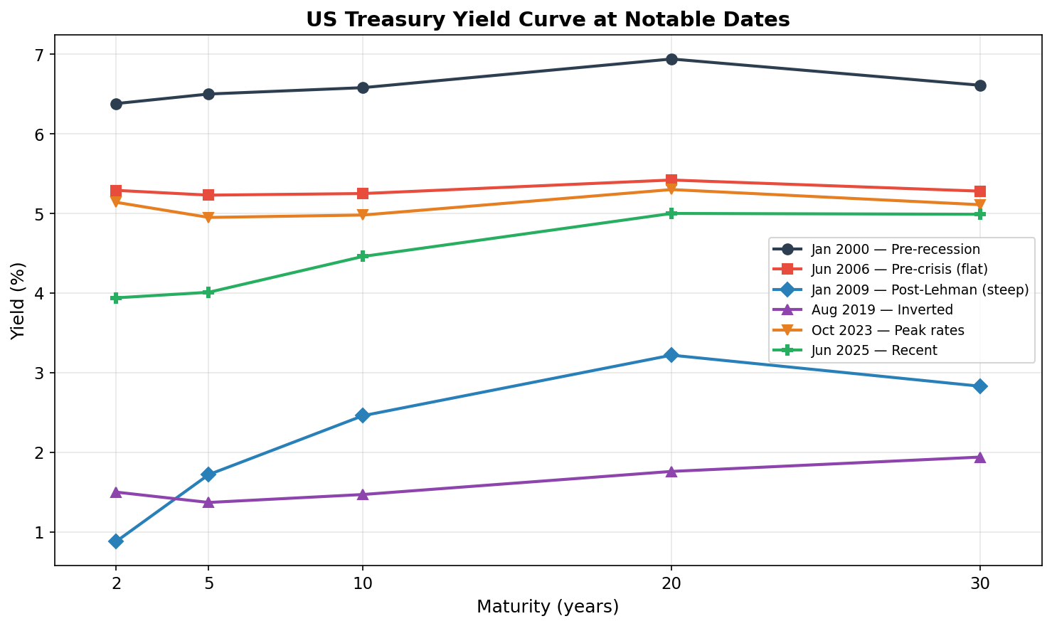
Each line is a snapshot of the yield curve on a single day. Notice how different they look:
- Jan 2000 (dark blue): A classic upward-sloping curve — long-term rates above short-term rates. This is the “normal” shape, reflecting that investors demand higher yields for longer commitments.
- Jun 2006 (red): Virtually flat. Short and long rates are nearly identical. Historically, a flattening or inverted curve has been one of the best recession predictors — and the 2008 crisis was less than two years away. I remember colleagues at Capital Group watching this with a growing sense of unease.
- Jan 2009 (blue): Post-Lehman, the Fed slashed short rates to near zero, but long rates stayed elevated. The curve is extremely steep — the gap between 2-year and 30-year rates is huge.
- Aug 2019 (purple): An inverted curve — the 2-year yield is above the 10-year. Markets were pricing in rate cuts. COVID hit six months later.
- Oct 2023 (orange): Peak of the 2022–2023 rate-hiking cycle. The entire curve has shifted upward, but it’s still inverted at the short end.
- Jun 2025 (green): The most recent snapshot.
Three types of movement are visible in these snapshots:
- Level shifts — the whole curve moves up or down (compare 2009 to 2023)
- Slope changes — the gap between short and long rates widens or narrows (compare 2006 flat to 2009 steep)
- Shape changes — the curve inverts or develops humps (compare 2000 normal to 2019 inverted)
We’ll quantify exactly how often each type occurs later in this post. But first, let’s understand the two key risk measures that bond managers use to handle these movements.
Duration and Convexity: A Quick Primer
Duration and convexity are the two most important risk measures in fixed income. I spent a good chunk of my CFA study time on these concepts, and then spent years at Capital Group seeing them applied in practice. Let’s understand them visually before diving into the formulas.
Duration: The Tangent Line
Duration measures how sensitive a bond’s price is to a change in yield. If a bond has a duration of 7 years and yields rise by 1%, the bond’s price falls by approximately 7%:
ΔP ≈ -D × Δy × P
where D is duration, Δy is the yield change, and P is the current price.
Think of it as a first-order approximation — the linear term in a Taylor expansion of the price-yield function. Geometrically, duration is the slope of the tangent line to the price-yield curve:
def bond_price(face, coupon_rate, ytm, maturity, freq=2):
    """Price a bond using standard discounted cash flow."""
    c = face * coupon_rate / freq
    n = int(maturity * freq)
    y = ytm / freq
    if y == 0:
        return c * n + face
    return c * (1 - (1 + y)**(-n)) / y + face / (1 + y)**n

def bond_mod_duration(face, coupon_rate, ytm, maturity, freq=2):
    """Modified duration in years."""
    c = face * coupon_rate / freq
    n = int(maturity * freq)
    y = ytm / freq
    P = bond_price(face, coupon_rate, ytm, maturity, freq)
    mac = sum(t * c / (1+y)**t for t in range(1, n+1)) + n * face / (1+y)**n
    return (mac / P / freq) / (1 + y)

# 10-year, 4% coupon bond — priced at par when yield = 4%
face, coupon, maturity = 100, 0.04, 10
ref_yield = 0.04

yields = np.linspace(0.005, 0.09, 300)
prices = [bond_price(face, coupon, y, maturity) for y in yields]

P0 = bond_price(face, coupon, ref_yield, maturity)
D = bond_mod_duration(face, coupon, ref_yield, maturity)

# Duration tangent: P(y) ≈ P0 × (1 - D × (y - y0))
tangent = P0 * (1 - D * (yields - ref_yield))

fig, ax = plt.subplots(figsize=(10, 6))
ax.plot(yields*100, prices, color='#2c3e50', linewidth=2.5, label='Actual bond price')
ax.plot(yields*100, tangent, color='#e74c3c', linewidth=2, linestyle='--',
        label=f'Duration approximation (D = {D:.1f} yrs)')
ax.plot(ref_yield*100, P0, 'ko', markersize=10, zorder=5)
ax.annotate(f'  Par (yield={ref_yield*100:.0f}%, price=${P0:.0f})',
            xy=(ref_yield*100, P0), fontsize=10, xytext=(15, -20),
            textcoords='offset points')
ax.set_xlabel('Yield to Maturity (%)')
ax.set_ylabel('Bond Price ($)')
ax.set_title('Bond Price vs. Yield — Duration as the Tangent Line', fontweight='bold')
ax.legend(loc='upper right')
plt.tight_layout()
plt.show()
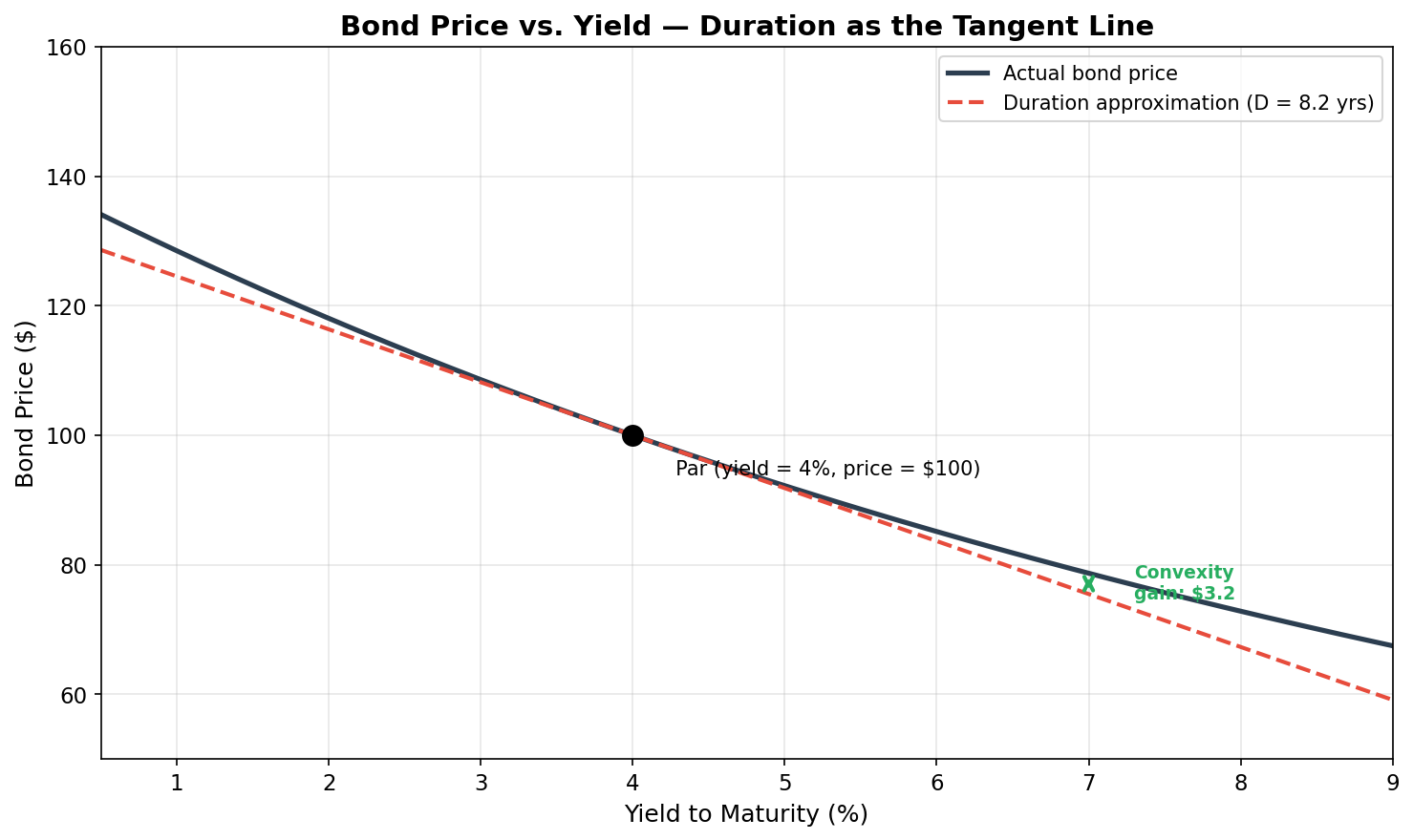
The dark curve shows how a 10-year, 4% coupon bond’s price actually changes as yields move. The dashed red line is the duration approximation — a straight line tangent to the curve at the current yield.
For small yield changes (say, ±50 bps), the tangent line is a terrific approximation. But notice what happens for larger moves: the actual price (dark curve) is always above the tangent line. When yields rise a lot, you lose less than duration predicts. When yields fall a lot, you gain more than duration predicts. That gap between the curve and the straight line is convexity — and it’s always in the bondholder’s favor.
Convexity: The Second-Order Correction
Convexity captures the curvature of the price-yield relationship. The full approximation is:
ΔP ≈ -D × Δy × P + ½ × C × (Δy)² × P
For small moves, the convexity term (which depends on Δy²) is negligible. But for larger moves, it becomes the dominant source of approximation error. Let’s see this in action:
def bond_convexity(face, coupon_rate, ytm, maturity, freq=2):
    """Dollar convexity of a bond."""
    c = face * coupon_rate / freq
    n = int(maturity * freq)
    y = ytm / freq
    P = bond_price(face, coupon_rate, ytm, maturity, freq)
    conv = sum(t*(t+1)*c / (1+y)**(t+2) for t in range(1, n+1))
    conv += n*(n+1)*face / (1+y)**(n+2)
    return conv / (P * freq**2)

C = bond_convexity(face, coupon, ref_yield, maturity)

# Range of yield changes
dy = np.linspace(-0.03, 0.03, 200)

actual_pct = [((bond_price(face, coupon, ref_yield+d, maturity) - P0) / P0 * 100) for d in dy]
dur_only_pct = -D * dy * 100
dur_conv_pct = (-D * dy + 0.5 * C * dy**2) * 100

fig, ax = plt.subplots(figsize=(10, 6))
ax.plot(dy*10000, actual_pct, color='#2c3e50', linewidth=2.5, label='Actual price change')
ax.plot(dy*10000, dur_only_pct, color='#e74c3c', linewidth=2, linestyle='--',
        label=f'Duration only (D = {D:.1f})')
ax.plot(dy*10000, dur_conv_pct, color='#27ae60', linewidth=2, linestyle=':',
        label=f'Duration + Convexity (C = {C:.0f})')
ax.fill_between(dy*10000, dur_only_pct, actual_pct, color='#27ae60', alpha=0.15,
                label='Convexity benefit')
ax.axhline(0, color='gray', linewidth=0.8, alpha=0.5)
ax.axvline(0, color='gray', linewidth=0.8, alpha=0.5)
ax.set_xlabel('Yield Change (basis points)')
ax.set_ylabel('Price Change (%)')
ax.set_title('Why Convexity Matters: Approximation Error Grows with Yield Moves',
             fontweight='bold')
ax.legend(loc='lower left', fontsize=9)
plt.tight_layout()
plt.show()
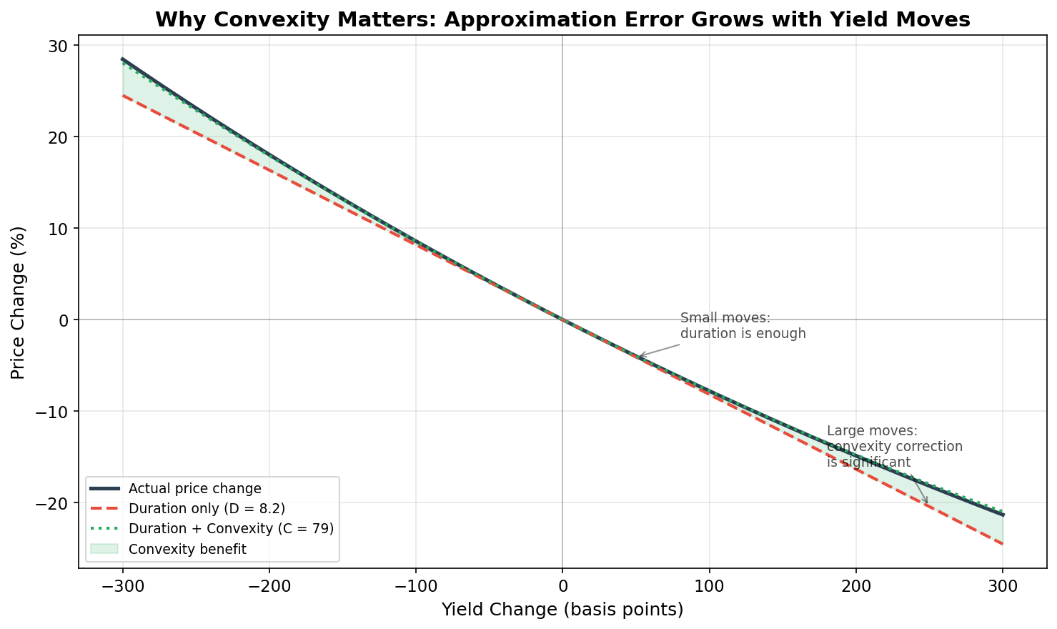
This chart is the key to understanding why both measures matter:
- For small moves (±50 bps): The three lines nearly overlap. Duration alone is a fine approximation. This is most trading days.
- For moderate moves (±100–150 bps): The red dashed line (duration only) starts to diverge from reality. The green dotted line (duration + convexity) tracks the actual price change closely. The green shaded area shows the “convexity benefit” — the amount by which duration overestimates your losses (or underestimates your gains).
- For large moves (±200–300 bps): The duration-only error is substantial — potentially several percentage points. This is where convexity becomes essential. These large moves are exactly the crisis scenarios from the GARCH post where GARCH flagged elevated volatility.
In practical terms: convexity is your friend. A bond with higher convexity (for the same duration) will outperform during large yield moves in either direction. This is why traders are willing to pay a premium for it.
The Big Assumption
Both duration and convexity assume a parallel shift — all maturities moving by the same amount. If yields across the entire curve rise by 50 bps, duration tells you exactly how much you’ll lose.
But what if the 2-year rises 75 bps while the 30-year rises only 25 bps? That’s a twist, and duration alone can’t capture it. Looking back at our yield curve snapshots, we can see that twists clearly do happen — the curve doesn’t just shift up and down, it changes shape.
So how often do yields actually move in parallel? This is exactly the question PCA was built to answer — and after the intuition we built in the previous post, we’re ready to run it.
PCA: Decomposing the Yield Curve
As we discussed in the previous post, PCA finds the orthogonal directions of maximum variance in a dataset. Applied to daily yield changes across multiple maturities, it will tell us:
- How many independent “factors” drive the yield curve (fewer is simpler)
- What each factor looks like (parallel shift? twist? something else?)
- How much of the total variance each factor explains (this is the key number)
Fetching Multi-Maturity Data
We already have the yield curve data from the snapshot chart above. Let’s compute daily changes and run PCA:
from sklearn.decomposition import PCA

# Daily changes (already have df_yc from earlier)
daily_changes = df_yc.diff().dropna()

print(f"Date range: {daily_changes.index.min().date()} to {daily_changes.index.max().date()}")
print(f"Trading days: {len(daily_changes):,}")
print(f"Maturities: {', '.join(maturities)}")
Running PCA
X = daily_changes.values  # shape: (days, 5 maturities)

pca = PCA(n_components=3)
pca.fit(X)

print("Variance explained by each component:")
for i, ratio in enumerate(pca.explained_variance_ratio_, 1):
    print(f"  PC{i}: {ratio*100:.1f}%")
print(f"  Total (3 PCs): {sum(pca.explained_variance_ratio_)*100:.1f}%")
Typical output (your exact numbers may vary slightly depending on the date range):
  PC1: 87.7%
  PC2:  9.8%
  PC3:  1.5%
  Total (3 PCs): 99.0%
Just as we previewed in the PCA explainer: a single factor explains ~88% of all yield curve movements. Two factors explain ~97%. Three factors explain ~99%.
The yield curve, despite having five maturities (or really, a continuous infinity of possible shapes), effectively moves in just two or three ways. This result was first documented by Litterman and Scheinkman in 1991 and has been confirmed repeatedly across markets and time periods since. Wesley Phoa’s work extended this finding to international yield curves and explored its practical implications for portfolio management — and what I saw in the data at Capital Group was entirely consistent with what he’d published.
The Three Factors: Level, Slope, Curvature
Let’s look at what each principal component actually is by plotting its loadings — how each maturity contributes to each factor:
maturities_years = np.array([2, 5, 10, 20, 30])

fig, ax = plt.subplots(figsize=(8, 5))
colors = ['#2c3e50', '#e74c3c', '#3498db']
labels = ['PC1 — Level', 'PC2 — Slope', 'PC3 — Curvature']

for i in range(3):
    pct = pca.explained_variance_ratio_[i] * 100
    ax.plot(maturities_years, pca.components_[i], marker='o', linewidth=2.5,
            markersize=8, color=colors[i],
            label=f'{labels[i]} ({pct:.1f}%)')

ax.axhline(0, color='gray', linestyle='--', alpha=0.5)
ax.set_xlabel('Maturity (years)')
ax.set_ylabel('Loading')
ax.set_title('Principal Component Loadings of Yield Curve Changes', fontweight='bold')
ax.set_xticks(maturities_years)
ax.legend()
plt.tight_layout()
plt.show()
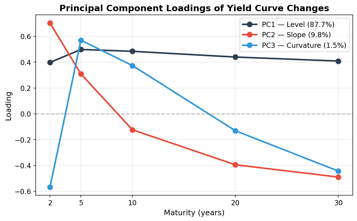
The three components have a clear and intuitive economic interpretation:
PC1 — Level (Parallel Shift) ≈ 88%
All loadings have the same sign and roughly similar magnitude. When this factor moves, yields across all maturities go up or down together. This is the parallel shift — the exact movement that duration is designed to capture.
This single factor drives nearly 88% of all yield curve variation. That’s why duration works so well as a risk measure: it’s tuned to the dominant mode of interest rate risk.
PC2 — Slope (Steepening/Flattening) ≈ 10%
The loadings change sign across the curve. Short maturities load positively; long maturities load negatively (or vice versa). When this factor moves, the spread between short and long rates widens or narrows. This is a twist — the curve steepens or flattens.
This happens when, say, the Fed raises short-term rates but long rates stay anchored (flattening), or when the economy improves and long rates rise faster than short rates (steepening).
PC3 — Curvature (Butterfly) ≈ 1.5%
The loadings have a hump shape — middle maturities move differently from both the short and long ends. This is a butterfly move, where the belly of the curve diverges from the wings.
This factor is the least important. Wesley noted in his research that the curvature factor tends to be less stable over time than the first two — it shifts character across different market regimes, making it harder to hedge and less useful for day-to-day risk management. I saw this firsthand: the level and slope factors were remarkably consistent over time, but the curvature factor felt more like noise than signal in many of our analyses.
Quantifying Duration’s Dominance
Let’s visualize why duration captures most of the risk:
ratios = pca.explained_variance_ratio_ * 100
cumulative = np.cumsum(ratios)

fig, ax = plt.subplots(figsize=(7, 5))
bars = ax.bar(
    ['PC1\n(Level)', 'PC2\n(Slope)', 'PC3\n(Curvature)'],
    ratios,
    color=['#2c3e50', '#e74c3c', '#3498db'],
    alpha=0.85, edgecolor='white', linewidth=1.5,
)
ax.plot(range(3), cumulative, color='#e67e22', marker='o', linewidth=2.5,
        markersize=8, label='Cumulative')

for i, (r, c) in enumerate(zip(ratios, cumulative)):
    ax.text(i, r + 1.5, f'{r:.1f}%', ha='center', fontsize=11, fontweight='bold')

ax.set_ylabel('Variance Explained (%)')
ax.set_title('Why Duration Works: Yield Curve PCA', fontweight='bold')
ax.set_ylim(0, 108)
ax.legend()
plt.tight_layout()
plt.show()
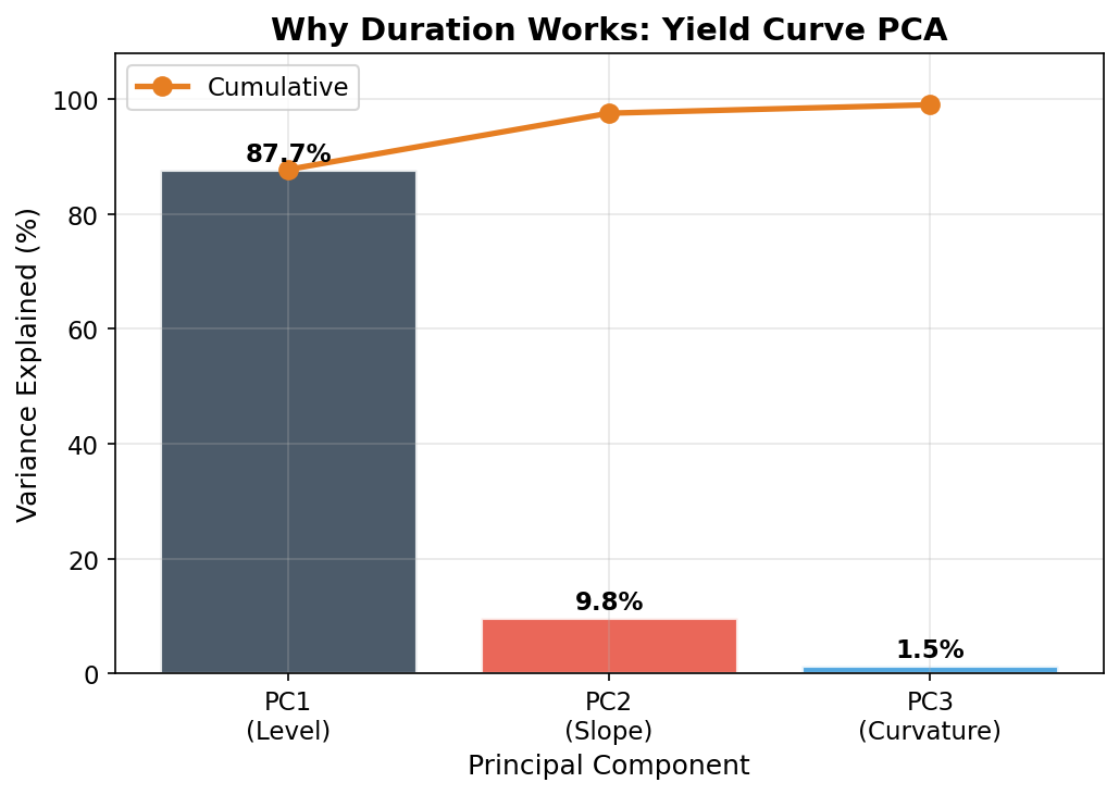
The logic is straightforward:
- Duration captures the effect of parallel shifts (PC1) → explains ~88% of yield curve risk
- Convexity captures the nonlinear price response and provides some protection against twists → covers much of the next ~10%
- Key rate durations (maturity-specific sensitivities) can explicitly address slope and curvature → covers the remaining ~2%
Two numbers (duration and convexity) capture 90%+ of what is, in principle, an infinite-dimensional risk. When I was studying for the CFA, this felt like a nice theoretical result. After years of watching portfolios in practice, I can tell you it’s one of the most practically important facts in fixed income.
How Often Is the Parallel Shift Dominant?
The variance explanation tells us about magnitude — PC1 accounts for the biggest moves. But let’s also ask about frequency: on what fraction of trading days is the level shift the largest component?
# Project each day's yield changes onto the PCs
scores = pca.transform(X)
scores_df = pd.DataFrame(
    scores, index=daily_changes.index,
    columns=['PC1', 'PC2', 'PC3']
)

# On each day, which PC has the largest absolute score?
dominant = scores_df.abs().idxmax(axis=1)
counts = dominant.value_counts(normalize=True) * 100

print("Which factor dominates each trading day?")
for pc in ['PC1', 'PC2', 'PC3']:
    pct = counts.get(pc, 0)
    label = {'PC1': 'Level (parallel)', 'PC2': 'Slope (twist)', 'PC3': 'Curvature'}[pc]
    print(f"  {pc} ({label}): {pct:.1f}% of days")
Typical results:
  PC1 (Level): ~73% of days
  PC2 (Slope): ~23% of days
  PC3 (Curvature): ~4% of days
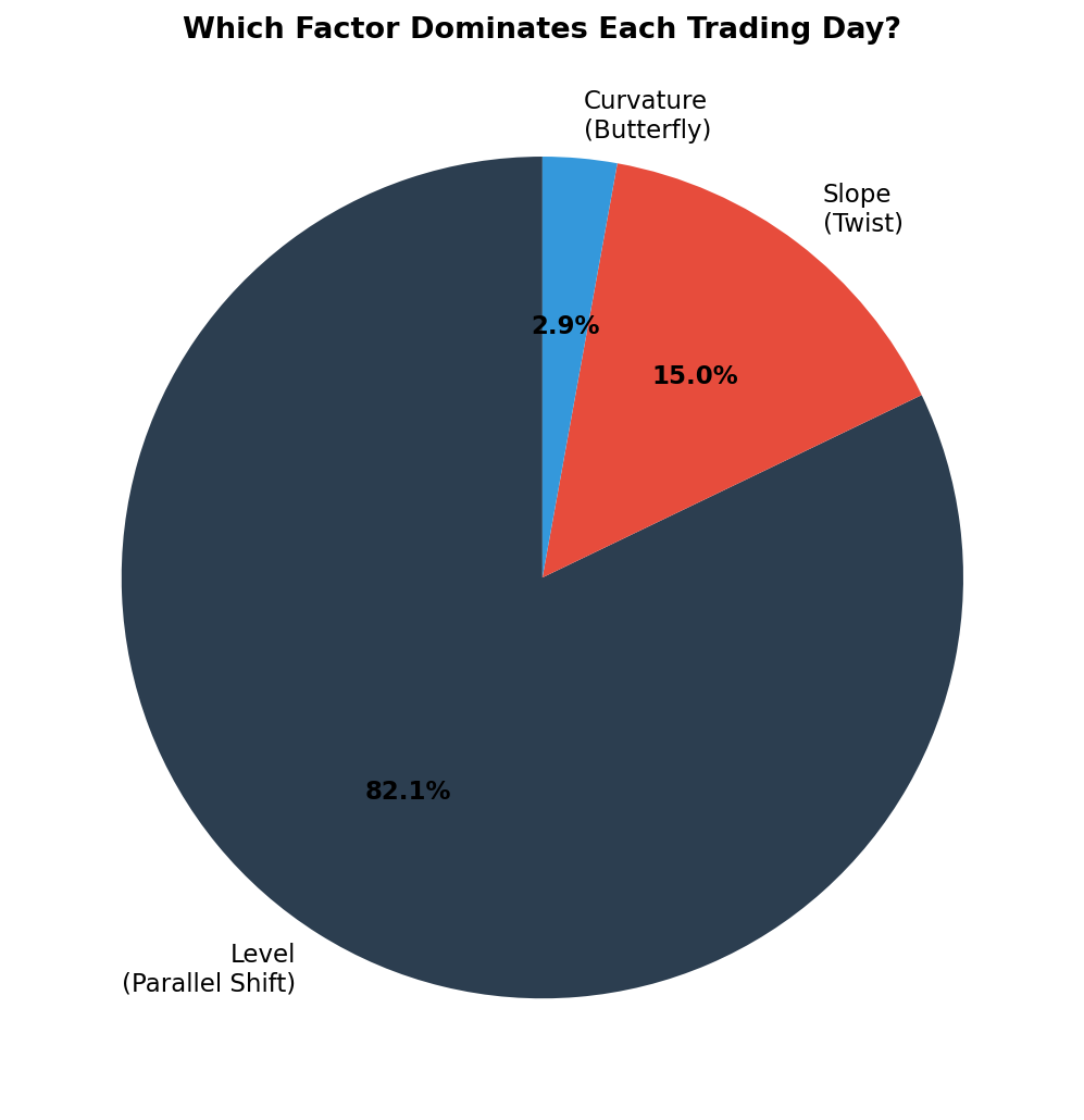
So the parallel shift is the largest daily component about 73% of the time. It dominates variance (~88%) more than frequency (~73%) because when parallel shifts happen, they tend to be bigger than twists.
The 23% of days where slope dominates are often days with Fed announcements, economic data releases, or geopolitical events that affect short and long rates differently. On those days, a pure duration hedge misses part of the move. But even then, the level component is still present — it’s just not the largest one. Duration still captures something, just not everything.
Barbell vs. Bullet: Convexity and Twist Protection
To make the PCA findings concrete, consider two portfolios with the same duration of 7 years but very different structures:
Bullet portfolio: Hold a single 7-year bond. All your exposure is concentrated at one maturity.
Barbell portfolio: Hold a mix of 2-year and 30-year bonds, weighted so the overall duration is 7 years. Your exposure is split across the ends of the curve.
# For a parallel shift, both portfolios behave identically
duration = 7.0
parallel_move = 0.50  # +50 bps

loss_bullet = -duration * parallel_move
loss_barbell = -duration * parallel_move  # same duration → same loss

print(f"Parallel shift +50bps:")
print(f"  Bullet loss:  {loss_bullet:.1f}%")
print(f"  Barbell loss: {loss_barbell:.1f}%")

# For a steepening twist: short rates +75bps, long rates +25bps
# Bullet: exposed only to ~50bps at the 7yr point (interpolated)
# Barbell: exposed to +75bps at 2yr AND +25bps at 30yr
loss_bullet_twist = -7.0 * 0.50   # 7yr rate moves ~50bps (approx)
loss_barbell_twist = -(0.65 * 1.8 * 0.75 + 0.35 * 14.5 * 0.25)  # weighted key rates

print(f"\nSteepening twist (+75bps short, +25bps long):")
print(f"  Bullet loss:  ~{loss_bullet_twist:.1f}%")
print(f"  Barbell loss: ~{loss_barbell_twist:.1f}%")
During a steepening (short rates rise more than long rates), the barbell’s short-end holdings lose more, but its long-end holdings lose less. The net effect depends on the exact weights, but the key point is: the barbell’s exposure to both ends of the curve provides natural diversification against twist risk.
This structural diversification is related to convexity — the barbell has higher convexity than the bullet for the same duration. Higher convexity means:
- Better performance for large parallel moves (the second-order correction helps)
- More natural hedge against curve twists (because you’re spread across the curve)
This is why practitioners often say “more convexity is always better, all else equal.”
The PCA Factors Over Time
Let’s see how the factor scores evolve — when was the market dominated by parallel shifts vs twists?
fig, axes = plt.subplots(2, 1, figsize=(12, 8), sharex=True)

axes[0].plot(scores_df.index, scores_df['PC1'], color='#2c3e50', linewidth=0.5)
axes[0].set_title('PC1 Score (Level / Parallel Shift)', fontweight='bold')
axes[0].set_ylabel('Score')

axes[1].plot(scores_df.index, scores_df['PC2'], color='#e74c3c', linewidth=0.5)
axes[1].set_title('PC2 Score (Slope / Twist)', fontweight='bold')
axes[1].set_ylabel('Score')

plt.tight_layout()
plt.show()
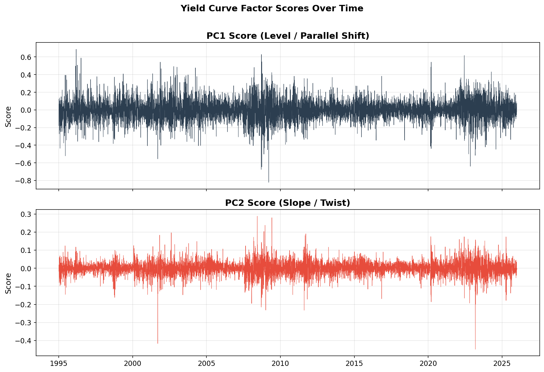
Notice that the PC1 (level) time series looks very similar to the 10-year yield change series from Parts 1 and 2 — which makes sense, since PC1 is essentially “all rates moving together.” The PC2 (slope) series shows distinct bursts during periods of Fed policy shifts, when the Fed was actively moving short rates while markets debated where long rates should be.
Key Rate Durations: The Bridge Between PCA and Practice
If duration captures ~88% of risk (PC1) and convexity adds a second-order buffer, what about the remaining ~10% from slope changes?
In practice, the answer is key rate durations — duration sensitivities calculated at specific maturities rather than assuming a parallel shift. Instead of a single duration number, you get a vector:
Portfolio key rate durations:
  2-year:  0.5
  5-year:  1.2
  10-year: 3.8
  20-year: 1.0
  30-year: 0.5
  ─────────────
  Total:   7.0  (= modified duration)
Key rate durations map directly to the PCA factors. Hedging PC1 (level) means matching total duration. Hedging PC2 (slope) means matching the distribution of duration across maturities — ensuring your short-end and long-end exposures are balanced relative to your benchmark.
For most investors, matching total duration (and monitoring convexity) is sufficient. Key rate durations become essential for:
- Large institutional portfolios with tight tracking error budgets
- Liability-driven investing (pension funds matching liability cash flows)
- Relative value trading (betting on specific curve shape changes)
Putting the Whole Series Together
Across this series, we’ve built a coherent picture of fixed-income risk from the ground up:
| Concept | What It Captures | Key Finding |
|---|---|---|
| Daily yield changes | Raw market moves | Fat tails + volatility clustering |
| GARCH(1,1) | Time-varying volatility | α+β ≈ 0.99 → persistent regimes |
| Dynamic VaR | Worst expected daily move | Adapts to regime; crisis breaches are larger and clustered |
| PCA of yield curve | Structure of multi-maturity moves | PC1 (parallel) = 88%, PC2 (twist) = 10% |
| Duration | Sensitivity to parallel shifts | Captures the dominant risk factor |
| Convexity | Second-order + partial twist protection | Improves hedge for large moves |
The big insight is that these pieces reinforce each other:
- GARCH VaR tells you how big a move to expect (and when to expect bigger ones)
- PCA tells you what shape the move will likely take (mostly parallel)
- Duration and convexity give you two numbers that capture 90%+ of your risk
For a software developer building a risk system, or a data scientist exploring financial modeling, this is a powerful starting point. You don’t need a PhD in finance to build meaningful risk analytics — you need good data, the right statistical tools, and an understanding of why simple models often outperform complex ones in practice.
I’ve been on both sides of this: learning the theory during my CFA studies, then spending years applying it to real portfolios at Capital Group with the guidance of people like Wesley Phoa. The math is elegant, but the real lesson is simpler — most of the risk in a bond portfolio comes from a small number of factors, and the classical tools were designed to capture the ones that matter most.
Where to Go From Here
If this series sparked your interest, here are natural next steps:
Try Student-t GARCH. Change
dist='normal'todist='t'in thearch_modelcall. The heavier tails often produce more accurate VaR estimates and fewer unexpected breaches.Add more maturities to PCA. Include 1-month, 3-month, 1-year, and 3-year rates for a richer picture. The three-factor structure (level, slope, curvature) is remarkably robust across different maturity sets.
Build a key rate duration hedge. Use the PCA loadings to construct hedges that neutralize both level and slope exposure. This is what real fixed-income trading desks do daily.
Combine GARCH with PCA. Fit separate GARCH models to each PC score. This gives you a full multivariate model: not just how big the move will be, but what shape it will likely take and how volatile each shape factor is.
Backtest a strategy. Use the dynamic VaR as a position-sizing signal: larger positions when GARCH volatility is low, smaller when it’s high. Simple, but it works.
Further Reading
- Phoa, Wesley, Advanced Fixed Income Analytics — Wesley’s book covers PCA of yield curves, duration, convexity, and much more. It’s the single best resource I know for the intersection of mathematical rigor and practical fixed-income risk management.
- Phoa (2000), “Yield Curve Risk Factors: Domestic and Global Contexts” — the research paper that extends PCA analysis to international curves with excellent intuition on why these factors matter
- Tuckman & Serrat, Fixed Income Securities — the standard textbook for bond math and risk measures
- Fabozzi, Fixed Income Analysis — comprehensive coverage at the CFA level
- Litterman & Scheinkman (1991), “Common Factors Affecting Bond Returns” — the original PCA-of-yields paper
- Engle (1982) and Bollerslev (1986) — the original ARCH and GARCH papers that started it all