A Brief Detour — What PCA Actually Does
In the GARCH post, we built a GARCH model for a single interest rate — the 10-year Treasury yield — and used it to detect when markets were in crisis mode. In the final post, we’re going to apply Principal Component Analysis (PCA) to the entire yield curve and discover something remarkable about its structure.
But before we do that, I want to spend a short post explaining what PCA actually is, because I think it’s one of those tools that gets taught in a way that’s more confusing than it needs to be. When I was studying for the CFA exams, I could mechanically apply PCA, but I didn’t have real intuition for it until someone explained it to me in plain terms. Let me try to do the same for you.
If you’re already comfortable with PCA, eigenvalues, and eigenvectors, feel free to skip ahead to the next post. This one is a warm-up for everyone else.
The Core Idea: Most of the Action Is in a Few Directions
Imagine you’re tracking the daily temperature at 50 weather stations spread across the United States. That’s 50 numbers per day — a 50-dimensional dataset. Sounds complex.
But think about what actually drives temperature variation. Most days, the dominant factor is something like “is it a warm day or a cold day nationally?” — a single number that moves all 50 stations up or down together. The second most important factor might be “is the east coast warmer or the west coast?” — a contrast between two regions. Maybe a third factor captures “is the south different from the north?”
With just those three factors, you could probably reconstruct 95%+ of the daily temperature variation at all 50 stations. The remaining 5% is local noise — a thunderstorm in Omaha, a sea breeze in San Diego.
That’s PCA. It takes a high-dimensional dataset and discovers the small number of underlying directions (factors) that explain most of the variance. It doesn’t know anything about geography or weather — it finds these patterns purely from the data.
Dimension Reduction: Throwing Away What Doesn’t Matter
The technical term for this is dimension reduction. You start with 50 dimensions (one per weather station) and discover that the data effectively lives in a 3-dimensional space. The other 47 dimensions are mostly noise.
Why is this useful?
- Understanding: Instead of staring at 50 correlated time series, you can think about 3 interpretable factors.
- Compression: You can store or transmit the 3 factor values instead of 50 station readings, with minimal loss.
- Modeling: Building a model with 3 inputs is vastly simpler (and less prone to overfitting) than one with 50.
- Hedging (in finance): If 3 factors drive 99% of the risk, you only need 3 hedges, not 50.
Eigenvectors: The Directions
PCA works by computing the eigenvectors of the data’s covariance matrix. Let’s strip away the jargon:
The covariance matrix captures how each variable relates to every other variable. For 50 weather stations, it’s a 50×50 table: the entry in row i, column j tells you how much stations i and j tend to move together.
The eigenvectors of this matrix are special directions in the data. They have two important properties:
They’re orthogonal — each eigenvector is perpendicular to all the others. This means the factors are uncorrelated; they capture independent patterns.
They’re ordered by importance — the first eigenvector captures the most variance, the second captures the most of what’s left, and so on.
Think of it like this: if you had a cloud of data points floating in space and you wanted to describe its shape with a single line, the first eigenvector is the line that goes through the thickest part of the cloud — the direction of maximum spread. The second eigenvector is the direction of maximum remaining spread, perpendicular to the first.
Eigenvalues: How Much Each Direction Matters
Each eigenvector has a corresponding eigenvalue, which tells you how much of the total variance that direction captures. If the first eigenvalue is much larger than the rest, it means one factor dominates — the data is “effectively one-dimensional” even though it technically has many dimensions.
In our weather analogy:
- PC1 eigenvalue (large): “warm day vs cold day nationally” explains most variation
- PC2 eigenvalue (medium): “east warmer vs west warmer” explains a decent chunk
- PC3 eigenvalue (small): “north-south gradient” explains a little
- PC4–PC50 eigenvalues (tiny): local noise — safe to ignore
The ratio of each eigenvalue to the total tells you the percentage of variance explained. This is the key number: it tells you how much you can simplify without losing information.
Seeing It in Two Dimensions
Let’s make this concrete with a simple visual example. We’ll create a 2D dataset where the points are stretched along a diagonal, then watch PCA find the principal directions:
import numpy as np
import matplotlib.pyplot as plt
from sklearn.decomposition import PCA

np.random.seed(42)
n = 300

# Create data that's stretched along a 45-degree diagonal
angle = np.pi / 4
main_spread = np.random.randn(n) * 3.0    # lots of variation along this axis
perp_spread = np.random.randn(n) * 0.6    # little variation perpendicular to it

x = main_spread * np.cos(angle) + perp_spread * np.sin(angle) + 5
y = main_spread * np.sin(angle) - perp_spread * np.cos(angle) + 3

# Run PCA
data = np.column_stack([x, y])
pca = PCA(n_components=2)
pca.fit(data)

# Plot
fig, ax = plt.subplots(figsize=(8, 7))
ax.scatter(x, y, alpha=0.35, s=20, color='#3498db')

# Draw eigenvectors as arrows, scaled by their eigenvalues
mean = data.mean(axis=0)
colors = ['#e74c3c', '#27ae60']
for i, (comp, var_ratio) in enumerate(zip(pca.components_,
                                           pca.explained_variance_ratio_)):
    scale = 2.5 * np.sqrt(pca.explained_variance_[i])
    ax.annotate('', xy=mean + comp * scale, xytext=mean,
                arrowprops=dict(arrowstyle='->', lw=3, color=colors[i]))
    label_offset = comp * scale * 1.15
    ax.text(mean[0] + label_offset[0], mean[1] + label_offset[1],
            f'PC{i+1} ({var_ratio*100:.0f}%)',
            fontsize=12, fontweight='bold', color=colors[i],
            ha='center', va='center')

ax.set_xlabel('Variable 1')
ax.set_ylabel('Variable 2')
ax.set_title('PCA Finds the Directions That Matter', fontweight='bold')
ax.set_aspect('equal')
ax.grid(True, alpha=0.3)
plt.tight_layout()
plt.show()
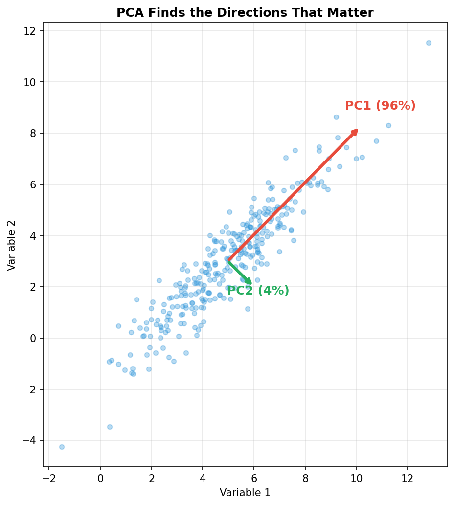
The red arrow (PC1) points along the long axis of the cloud — the direction of maximum spread. It captures ~96% of the variance. The green arrow (PC2) is perpendicular, capturing the remaining ~4%.
The punchline: even though this data has two dimensions, it’s effectively one-dimensional. If you projected everything onto the red arrow and threw away the green direction, you’d lose almost nothing. PC1 tells you nearly everything you need to know.
From 2D to 5D to Bond Portfolios
Now imagine the same idea, but instead of 2 variables, you have 5: daily yield changes at the 2-year, 5-year, 10-year, 20-year, and 30-year maturities. You can’t plot 5 dimensions, but PCA still works. It finds the directions (eigenvectors) and their importance (eigenvalues).
When we run this in the next post, we’ll find something remarkable:
- PC1 captures ~88% of yield curve variance — and it looks like all maturities moving together (a parallel shift)
- PC2 captures ~10% — and it looks like short and long rates moving in opposite directions (a twist)
- PC3 captures ~1.5% — and it’s a hump in the middle (curvature)
This means the yield curve — despite having infinite possible shapes — effectively moves in just 2 or 3 ways. And that is why the classical bond risk measures (duration and convexity) work as well as they do: they’re tuned to the dominant pattern that PCA reveals.
Quick Reference
| Term | What It Is | Intuition |
|---|---|---|
| Principal Component | A direction in the data | The “theme” or “factor” driving variation |
| Eigenvector | The mathematical direction | Points along the axis of maximum spread |
| Eigenvalue | The variance along that direction | How important this factor is |
| Variance Explained | Eigenvalue / total | What percentage of the action this factor captures |
| Dimension Reduction | Keeping only the top PCs | Simplifying without losing much information |
What’s Next
With this intuition in hand, we’re ready for the main event. In the next post, we’ll apply PCA to 30 years of yield curve data and discover the beautiful low-dimensional structure hiding inside. We’ll connect it to the classical risk measures — duration and convexity — and see quantitative proof of why these simple tools work as well as they do.